
Case Study Overview
- Who
- Chicago Fair Trade is the largest fair trade organization in the United States, increasing support for economic & environmental justice through consumer education, advocacy, and promotion of local fair trade businesses
- What
- Jack-of-all-trades freelance work, with focus on web development, digital strategy (information architecture; online donations, shops, and auctions), branding, illustration, print design (including large-format, apparel, stickers, mailers, wayfinding), and microsites
- When
- Seasonally from June 2009 – April 2025, though I assisted with an additional event and troubleshooting even after "retirement" from freelance work
Branding Refresh
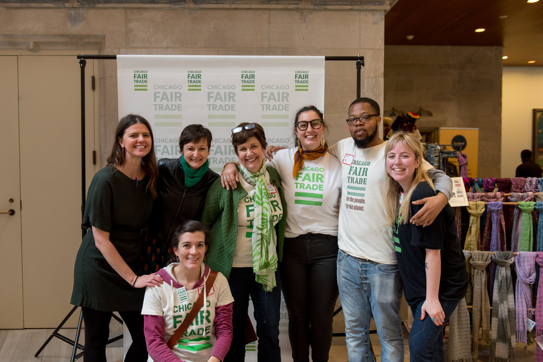
I first started working with Chicago Fair Trade in 2009 when I was an intern at Distant Village Packaging, a sustainable package design and brand design company. Some of Distant Village's clients were (unsurprisingly) involved in the fair trade scene and I attended their Globalfest fundraiser to act as their event photographer. I connected with CFT's then-Executive Director, Nancy Jones, who hired me to help with some event graphics and a logo refresh.
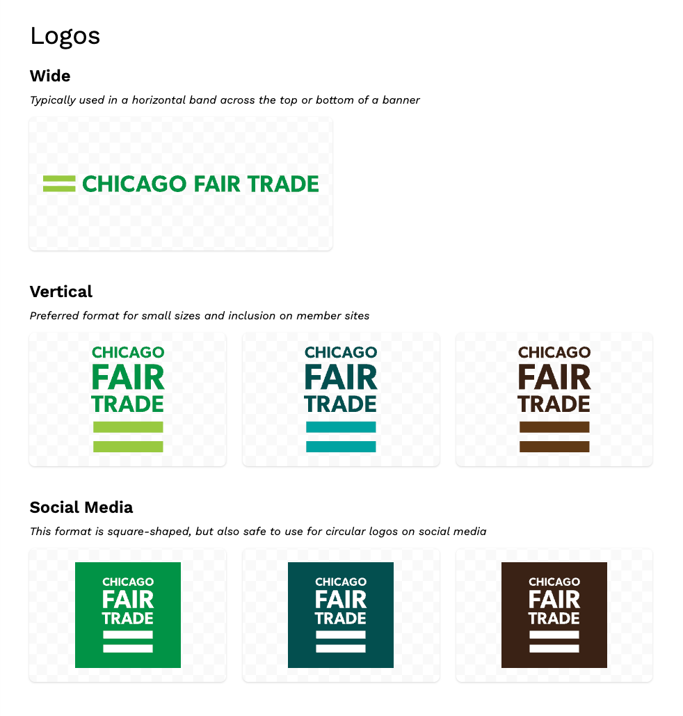
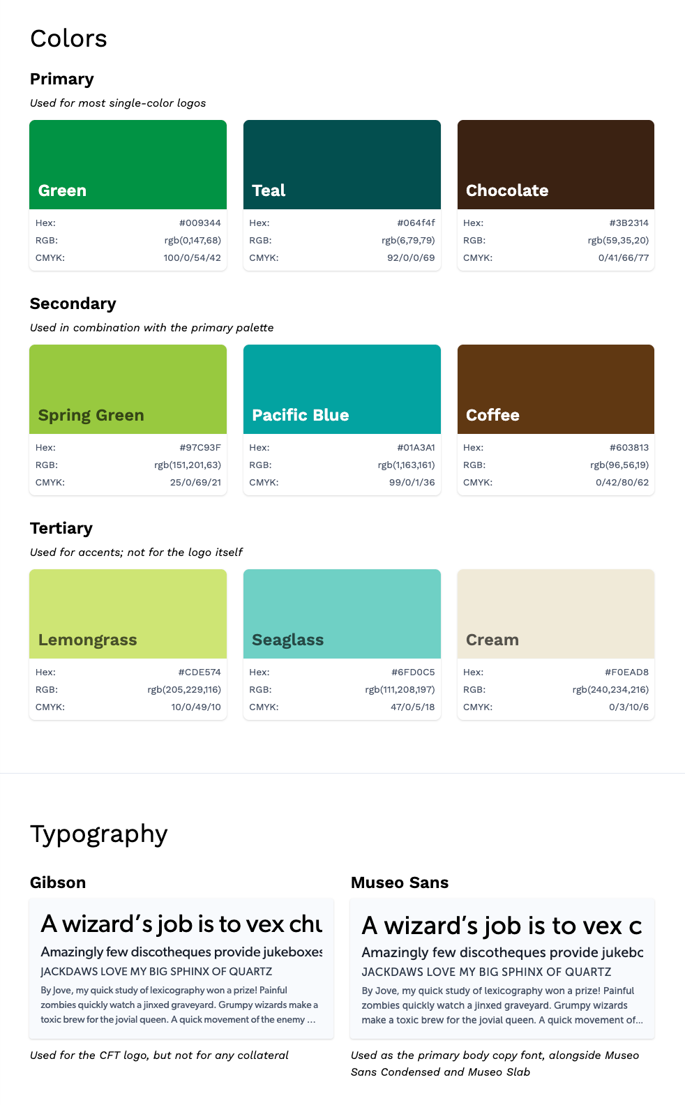
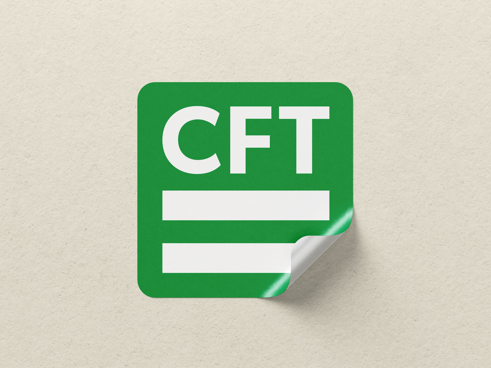
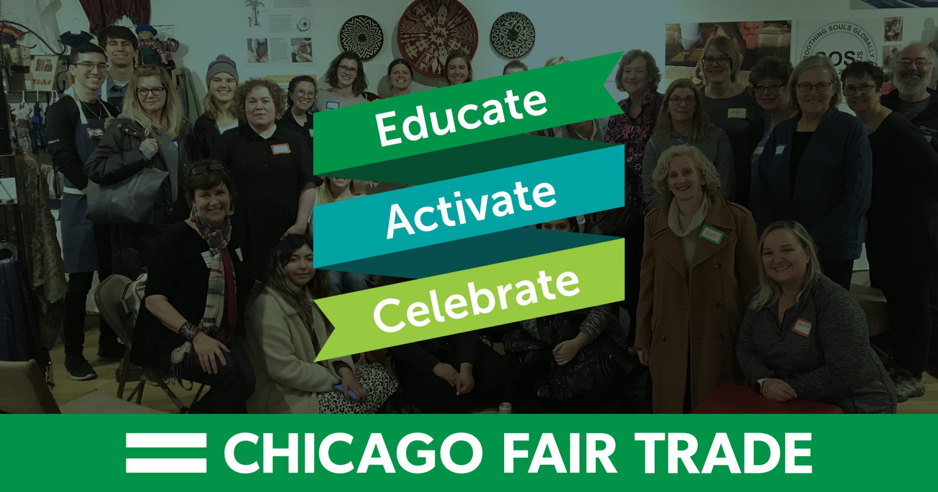
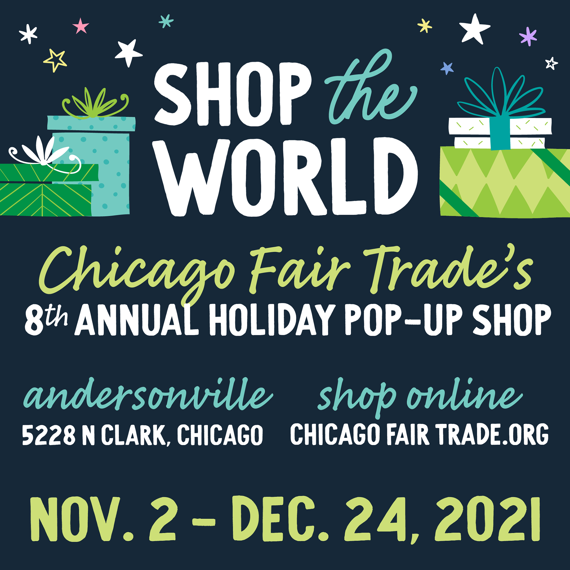
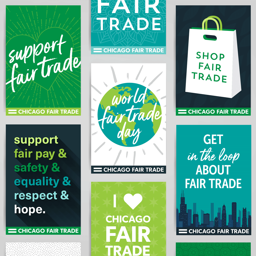
CFT primarily used an army green as their logo color, and one of their earlier accomplishments was a movement to get local museums to serve fair trade coffee. Using these as inspiration, I extended the palette to include vibrant versions of green, teal, and brown. The logo is primarily displayed in a two-tone green configuration, but has been used in one- and two-color versions in all of the primary tones. The former logo also used stencil-style font, which did not scale well. We changed to a clean sans-serif for better readability at small sizes.
Though event branding may feature a varying palette (bright, candy colors on World Fair Trade Day; jewel-tone colors for Globalfest), the focus is always on CFT's core palette, providing continuity when the rest of the design may differ.
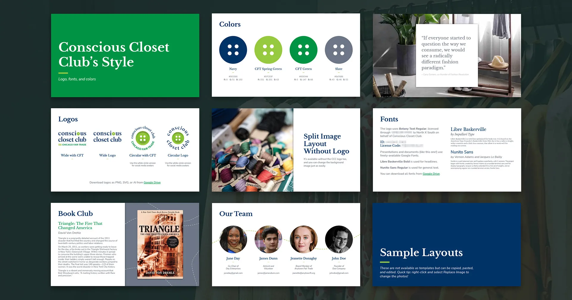
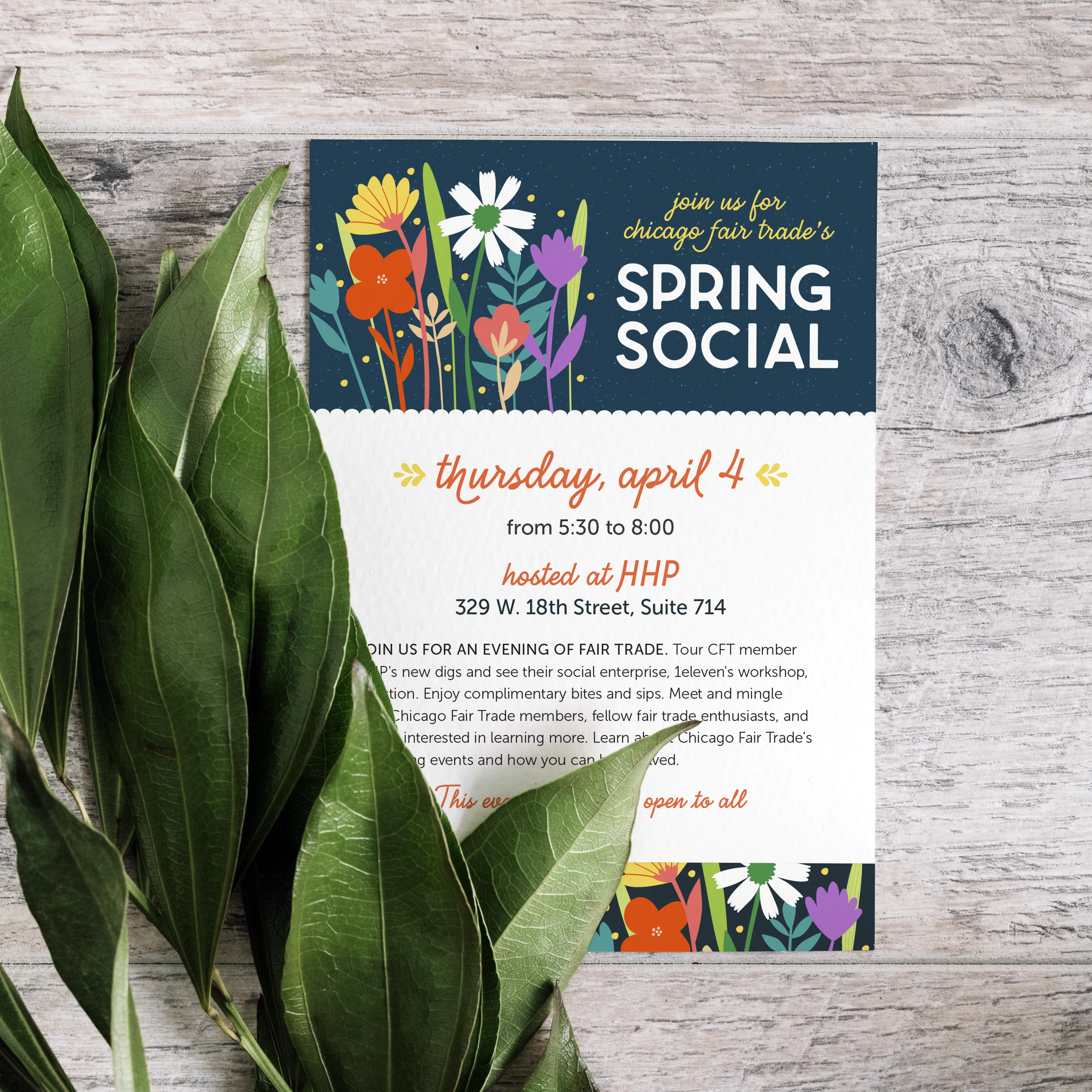
This also translated into their sub-brand for the Conscious Closet Club, which follows CFT's branding but also integrates a rich navy color and alternative typography. Below is a sample from their slideshow template and style guide:
Text-Heavy Documents
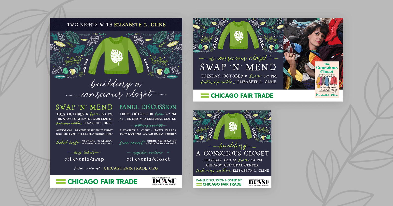
Designs with lots of text aren't always glamorous, but they are essential. I created templates for CFT's annual reports, membership forms, event registration, and more. Several of these documents, such as sponsorship forms, are interactive/fillable PDFs.
Because I worked with CFT for so long, I've been able to see the documents evolve as their business needs grew. Streamlining things like sponsorship offerings allowed me to explore new ways of displaying dense information. For instance, the 2020 Globalfest sponsorship letter used a heavier two-column text layout to cover all of the sponsorship levels and their perks, while the 2021 version used a colorful table to make it easier to compare options at a glance. We also moved towards having a digital-only way to become a sponsor and pay online, versus the older style of a written or fillable PDF with directions to mail in a check. Now, most sponsorship payments are handled entirely online.
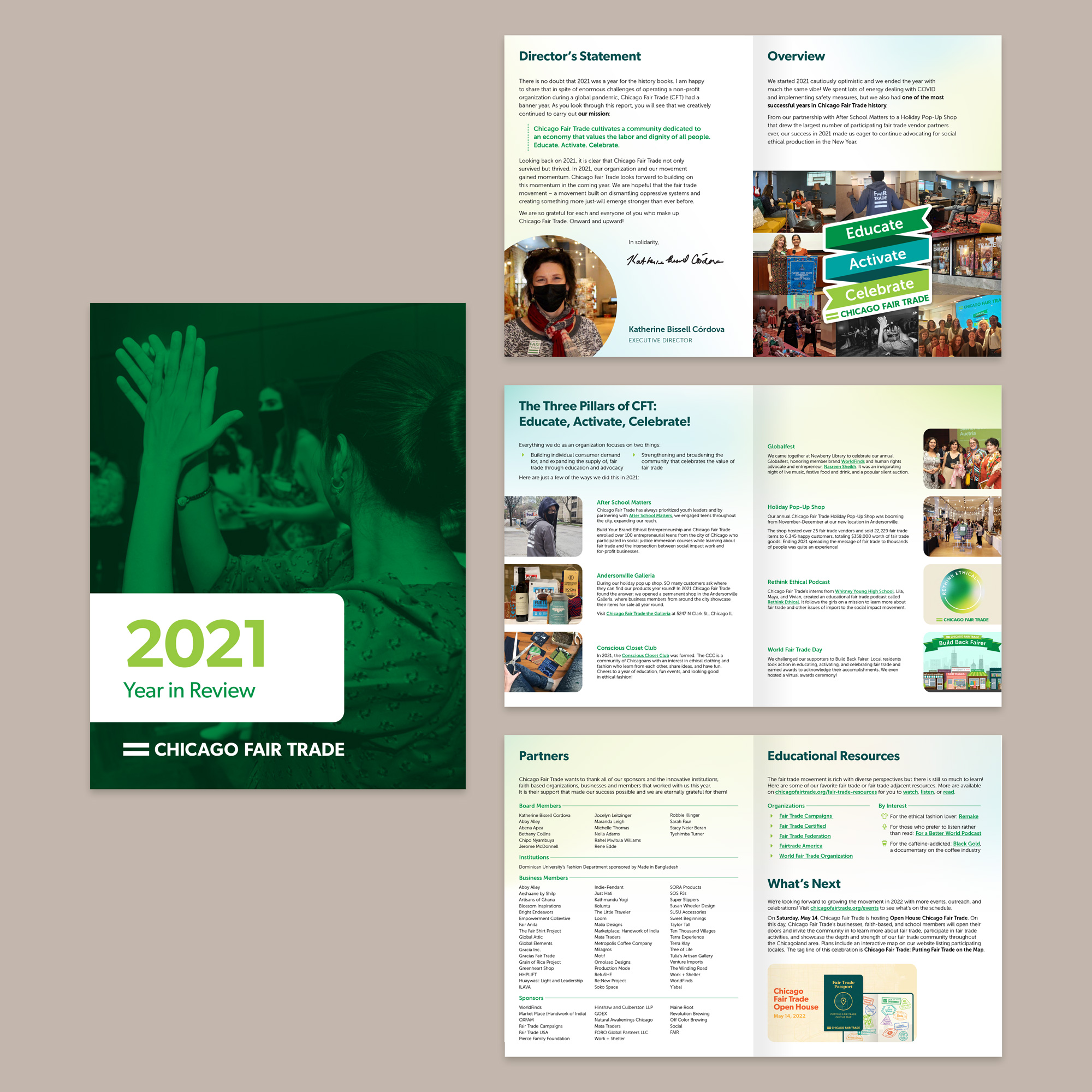
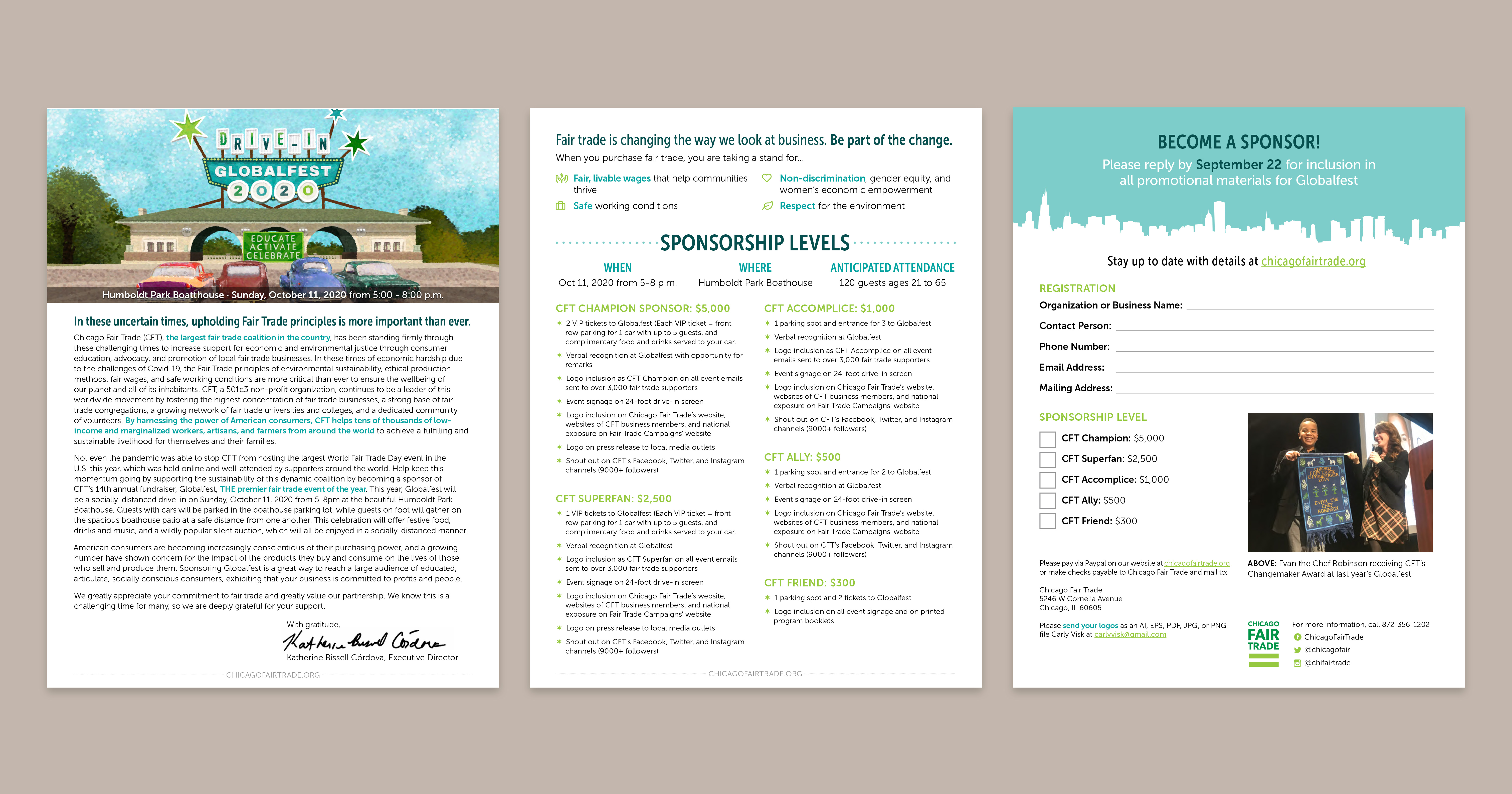
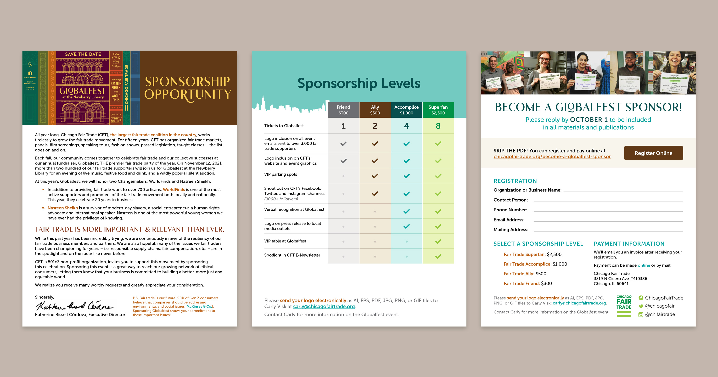
Illustration & Printing
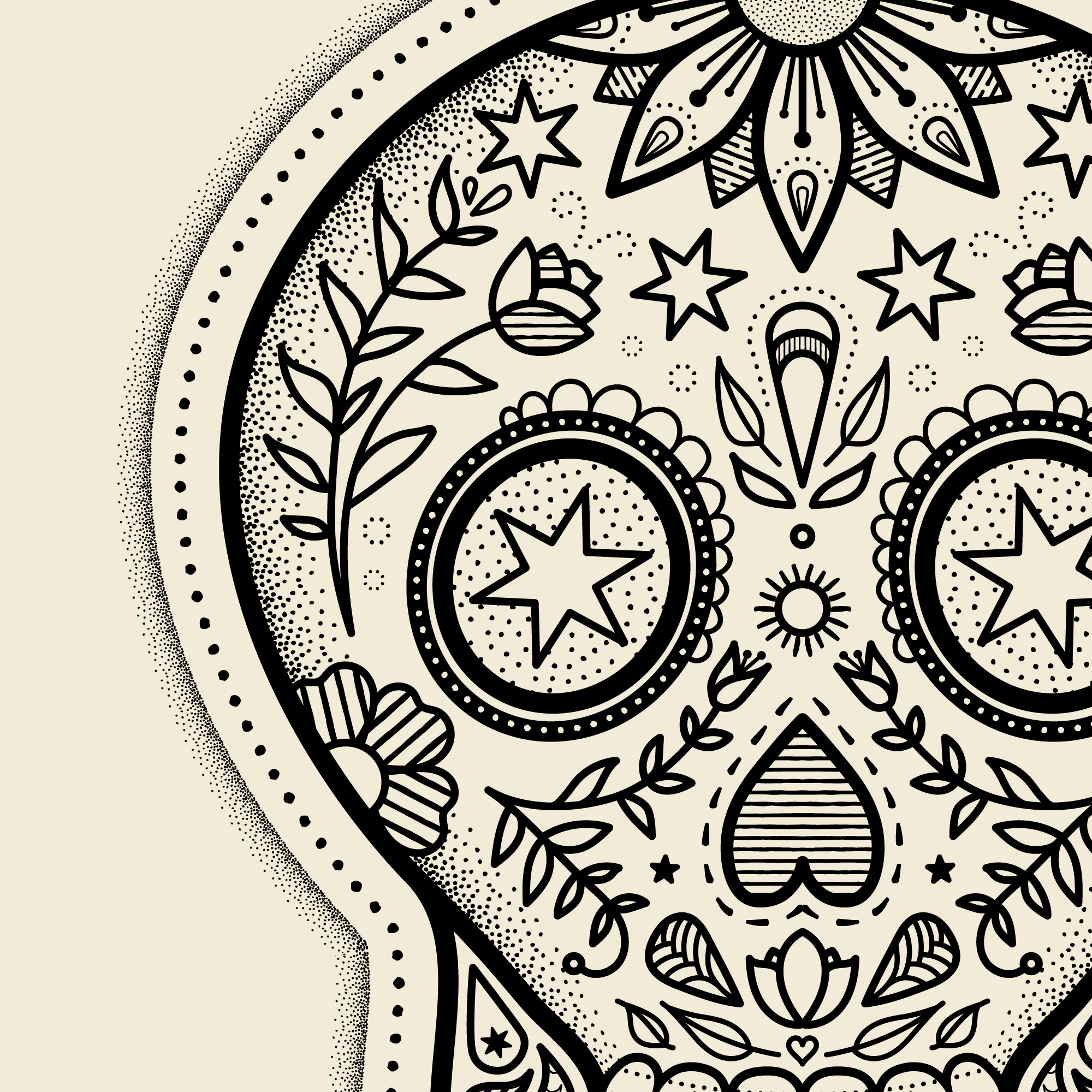
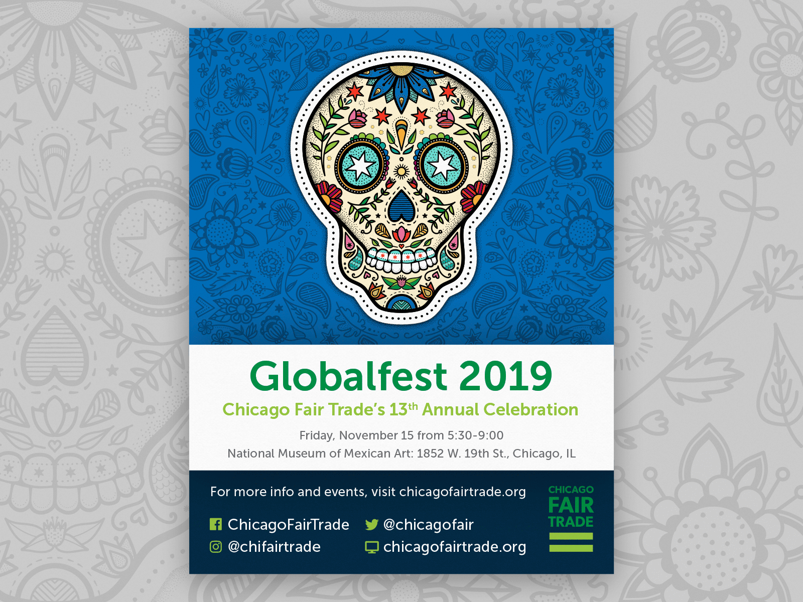
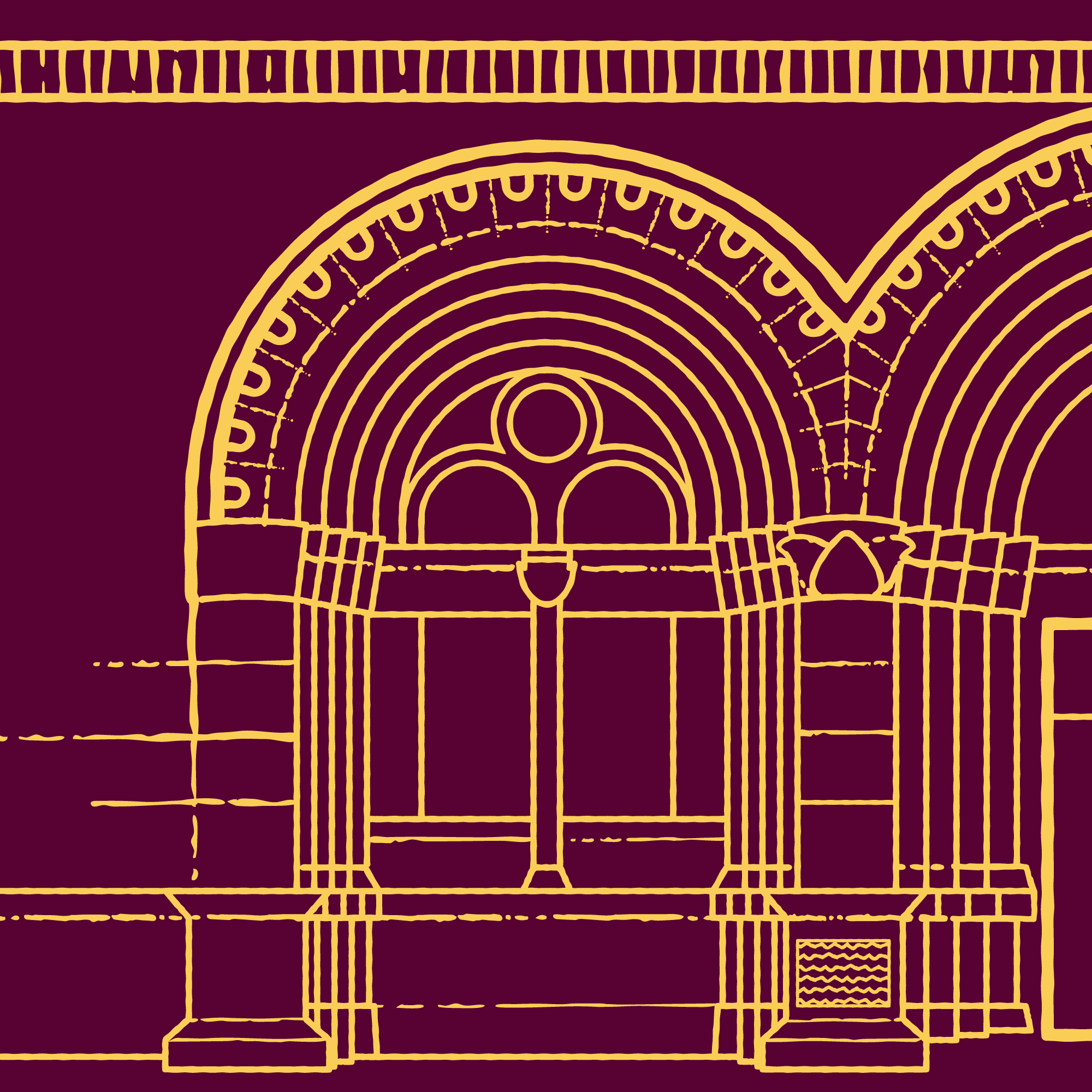
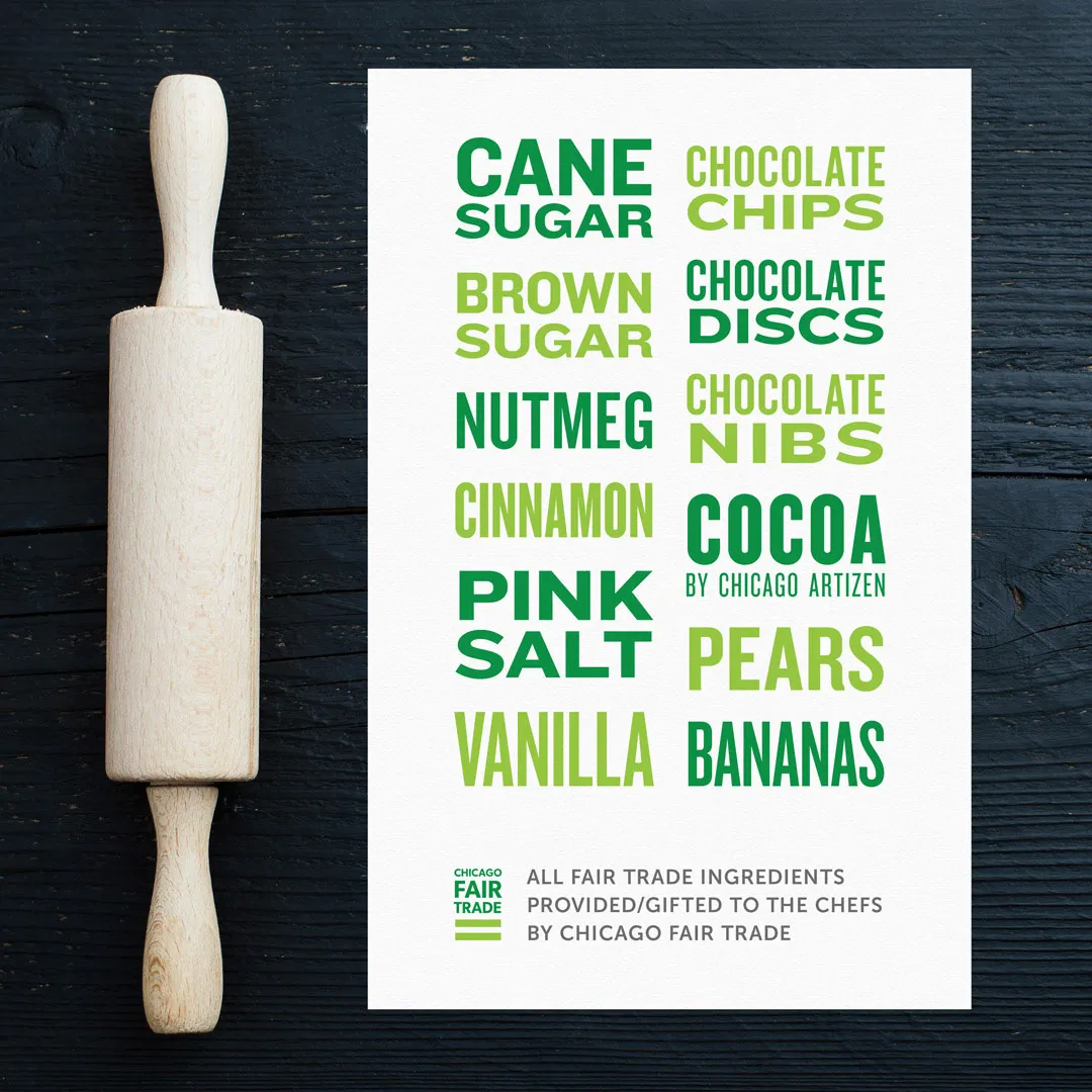
CFT's event collateral is often used digitally and in print — and to be trickier; the print size may not be known in advance. To account for this, I create vector artwork whenever possible. That way, projects will look crisp no matter where they end up, and the CFT team can reuse elements in the future without worrying about resolution or loss of quality.
I have a number of tried-and-true vector brushes in Adobe Illustrator that I have refined over the years, and I love to use techniques that still feel a little handmade or imperfect.
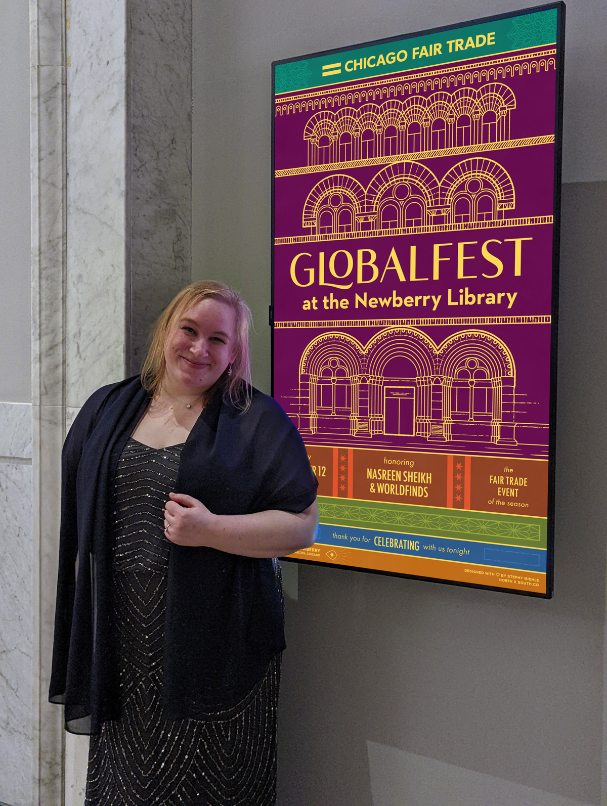
Below are close-ups from two years of the Globalfest celebration: a sugar skull for the event at the National Museum of Mexican Art, then an architectural illustration for the event at the Newberry Library.
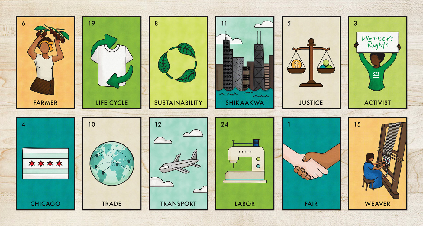
For the Chicago Fair Trade Museum branding, I created custom loterìa cards based on sketches from the CFT Executive Director's child. These have been reused as signs in the shop and have even been tiled as a pattern for apparel in the gift shop!
Typography as Illustration
I also love to use typography as an illustrative element and am thankful for the design freedom that comes with creating event collateral that doesn't have to strictly follow strict brand guidelines. One-off events or rebranded annual celebrations are a great opportunity for fun and experimentation.
More Case Studies
View all case studies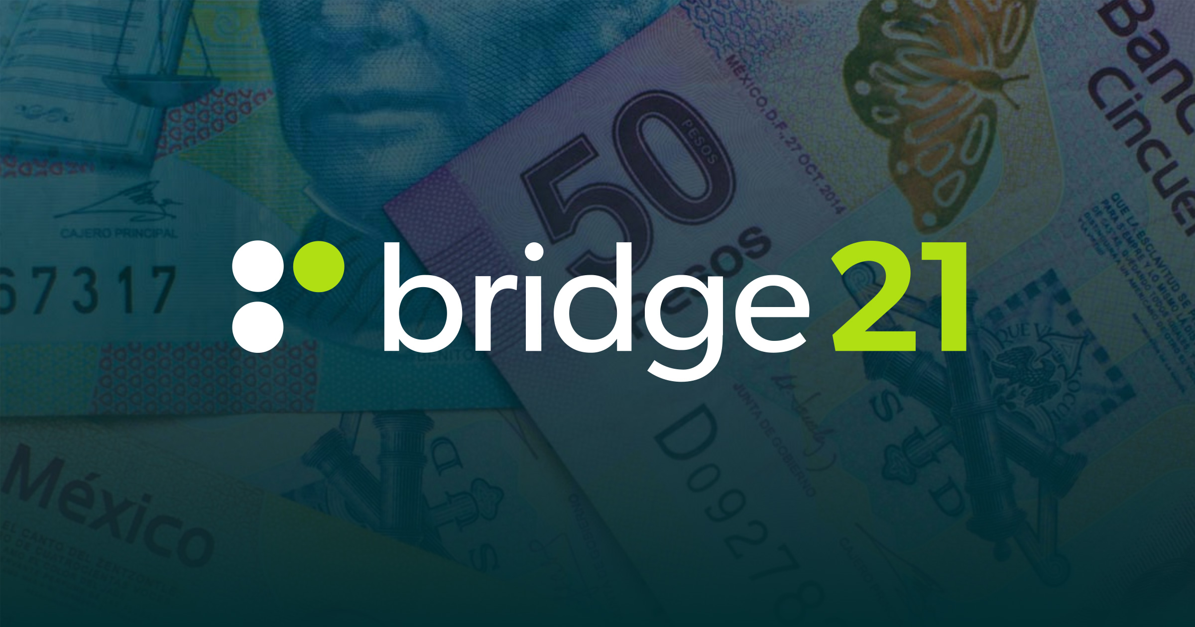
bridge21
bridge21 is a B2B and B2C fintech company using cryptocurrency to power more affordable international remittances.
I worked with bridge21 for 4½ years and was involved with everything from pitch decks to web development, branding, prototyping, and strategy.
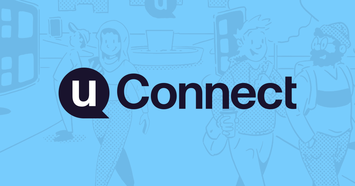
uConnect
uConnect is a virtual career services SaaS platform supporting hundreds of college & university career centers.
I work with uConnect as a UX & Accessibility Engineer, with a focus on the frontend. I've led major initiatives for accessibility compliance, email templates, and the development of the marketing website.