Case Study Overview
- Who
- uConnect is a virtual career services SaaS platform supporting hundreds of college & university career centers (including MIT, Yale, UCLA, and a bunch of other schools you'd recognize). Each "virtual career center" is a customized portal that serves as a hub for students and alumni to access career resources, job postings, events, and more.
- What
- UX and frontend engineering with a strong focus on accessibility, including major initiatives for compliance, email templates, and the development of the marketing website. More recent projects involve creating a design system and component library using React, Tailwind, shadcn, and Chart.js.
- When
- July 2022 – Present
Marketing Website
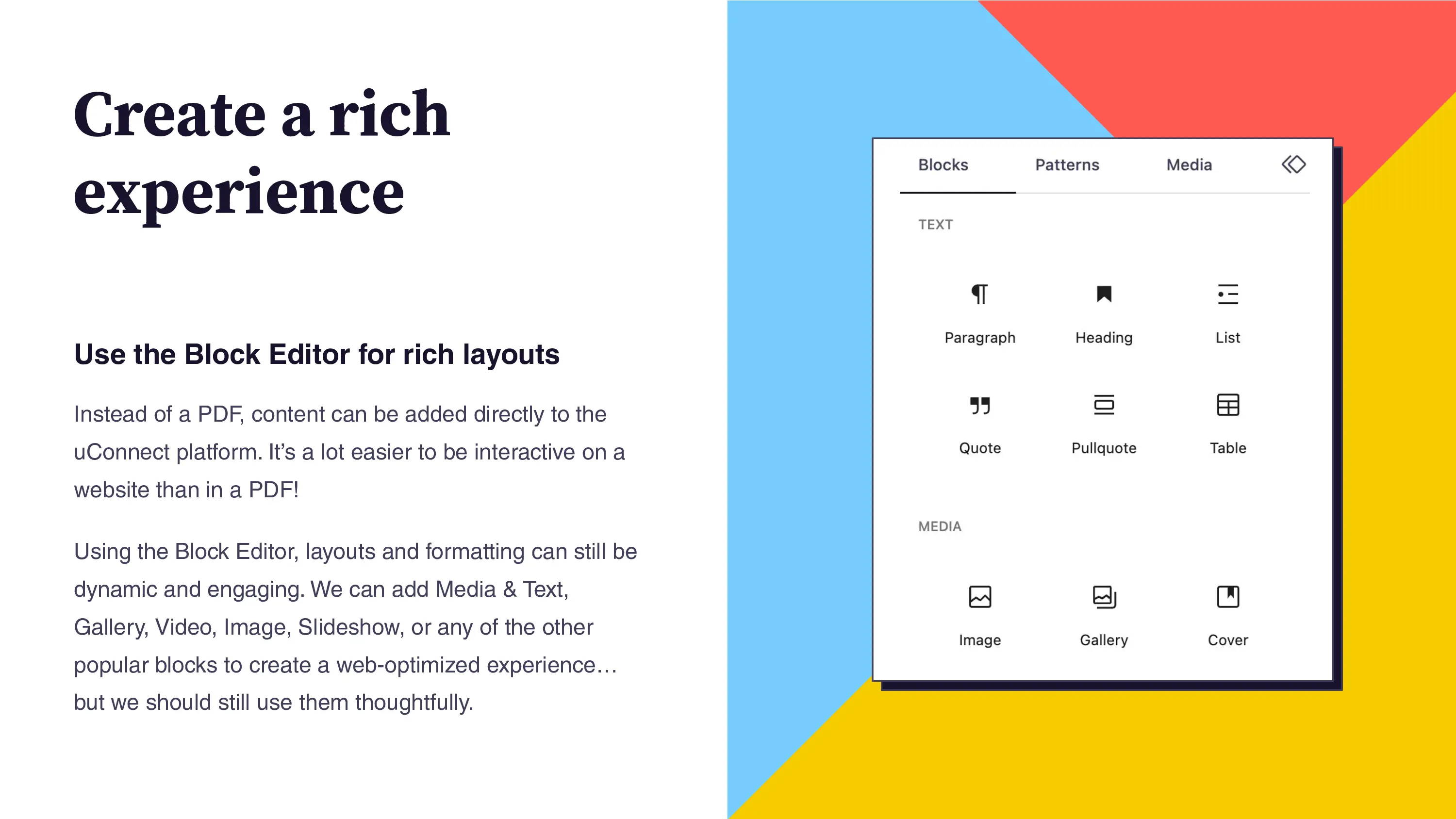
My first task as a new hire was to develop a new WordPress marketing website for uConnect. The overall design, branding, and copy were all provided, so I focused on implementation details, such as responsive design, performance optimization, and SEO best practices. I created a custom theme from scratch with a focus on the Block Editor so that the team could be empowered to make updates on their own while ensuring that the design system was maintained.
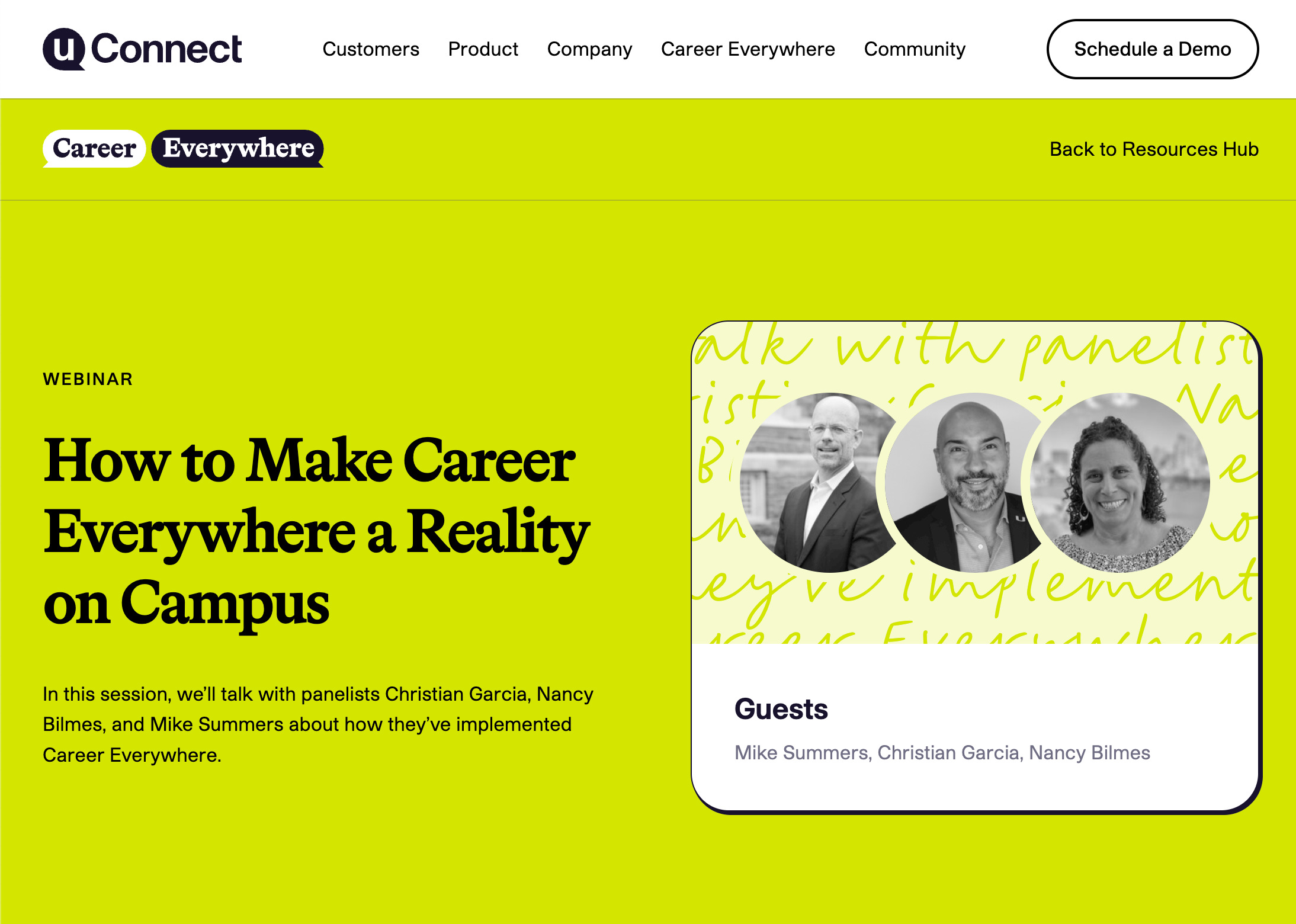
Maintenance-Free Typography & Image Styling
As a designer, I love fun typography. The provided designs featured styled hero sections with a handwriting font in the background. This created an amazing look, but became fussier when considering how things would look across a variety of screen sizes. Plus, every time the copy needed to be adjusted, we'd need a new image, which is not very sustainable. Though the text added visual texture, it was still meant to be (at least somewhat) read, and I have a strong stance against images of text when we can use real, live, accessible text and webfonts instead.
Because the text is “live”, it can be dynamically populated in custom post type templates, such as the webinar layout. This text is meant to be solely decorative, so I used aria-hidden="true" to hide it from screen readers and ensured that it was not selectable.
I also had fun using CSS masks so that images could be automatically styled into the uConnect icon "quote bubble" without needing to export a specific special version. Images become duotoned with the brand's navy color by default and are clipped to the shape without distorting the image.
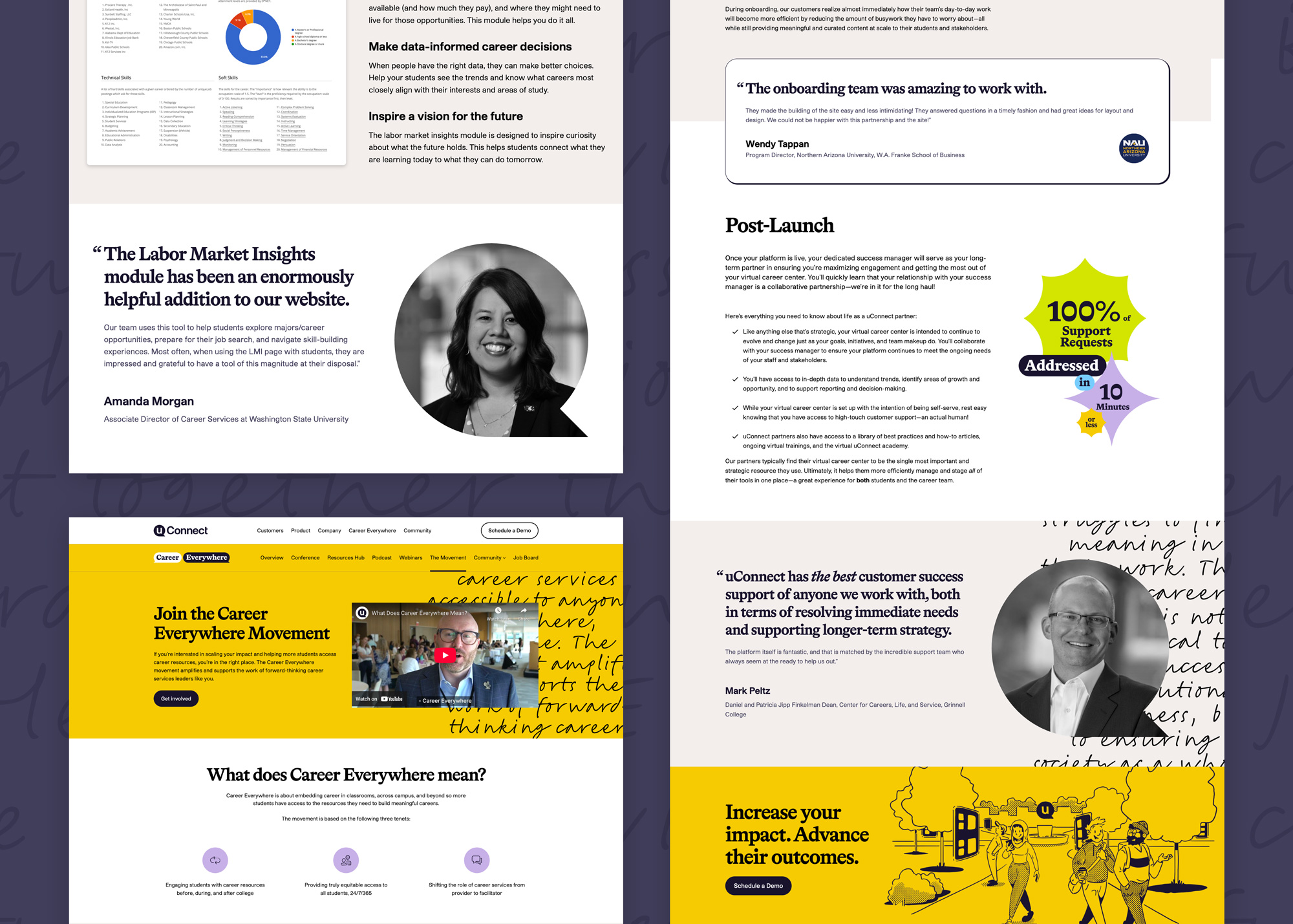
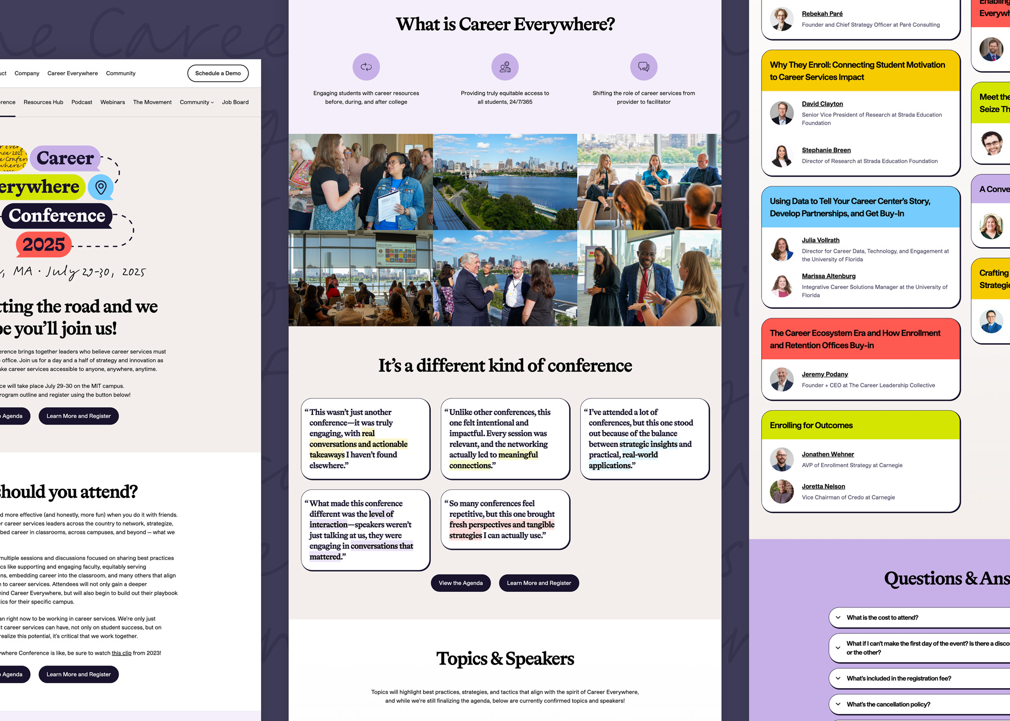
Expanding the Visual Language
Over time, the site grew beyond the provided designs, and I began expanding our visual language with new layout patterns and an extended color palette to be suitable for UI design.
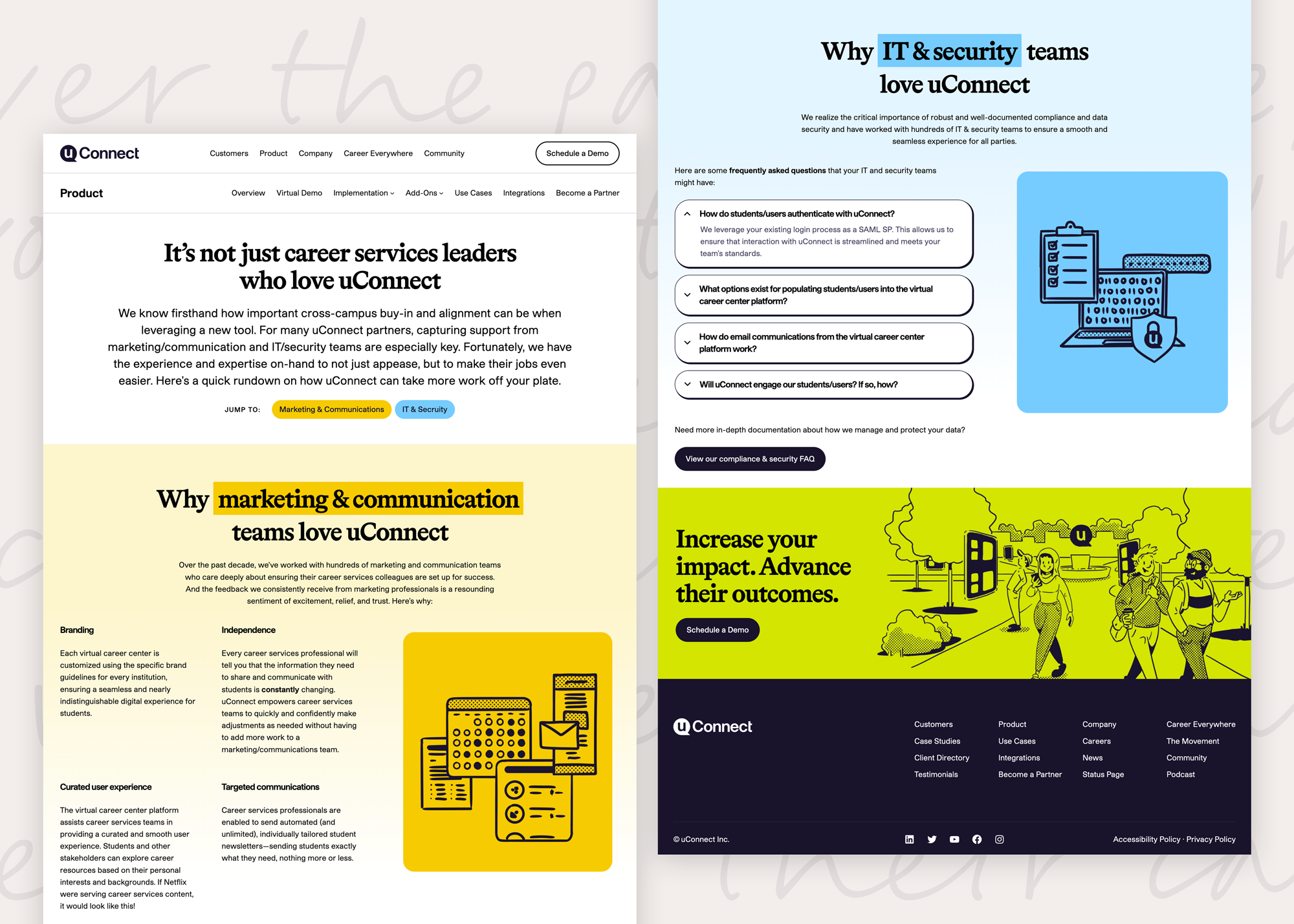
The color schemes were interesting to build out, as the brand designer had provided a light, base, and dark version for each accent color. However, these did not have uniform brightness or saturation. Creating more color variants with predictable luminosity scales makes the colors easier to work with in a design system. I made sure to calculate the correct color contrast (light or dark text) for each color. Last, I highlighted the "brand official" swatches for each color.
One of uConnect's sub-brands, Candid Career+, used an out-of-palette green for its branding. I extended the palette by creating variants for each accent color that had similar transformations (a bit brighter and punchier) for future use in additional sub-brands. These can be seen in the "A" (accent) sections in each color card below:
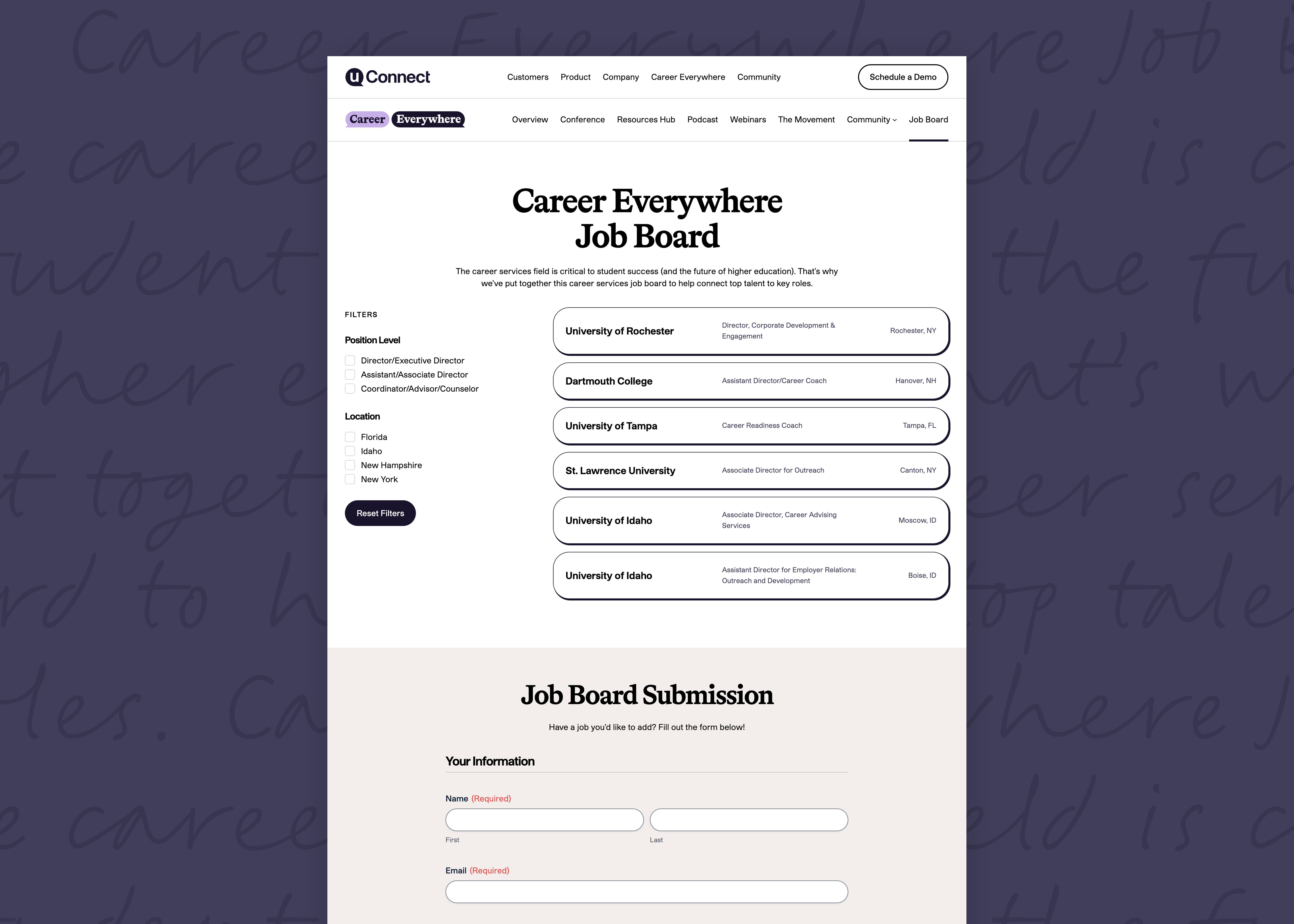
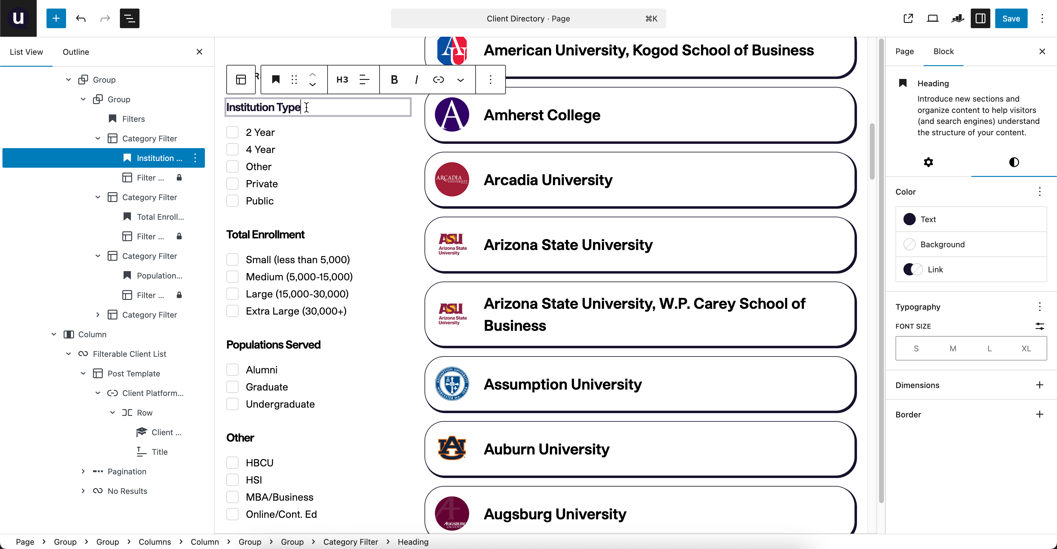
Tricky Details
Some of the trickier sections involved filterable and API-driven content:
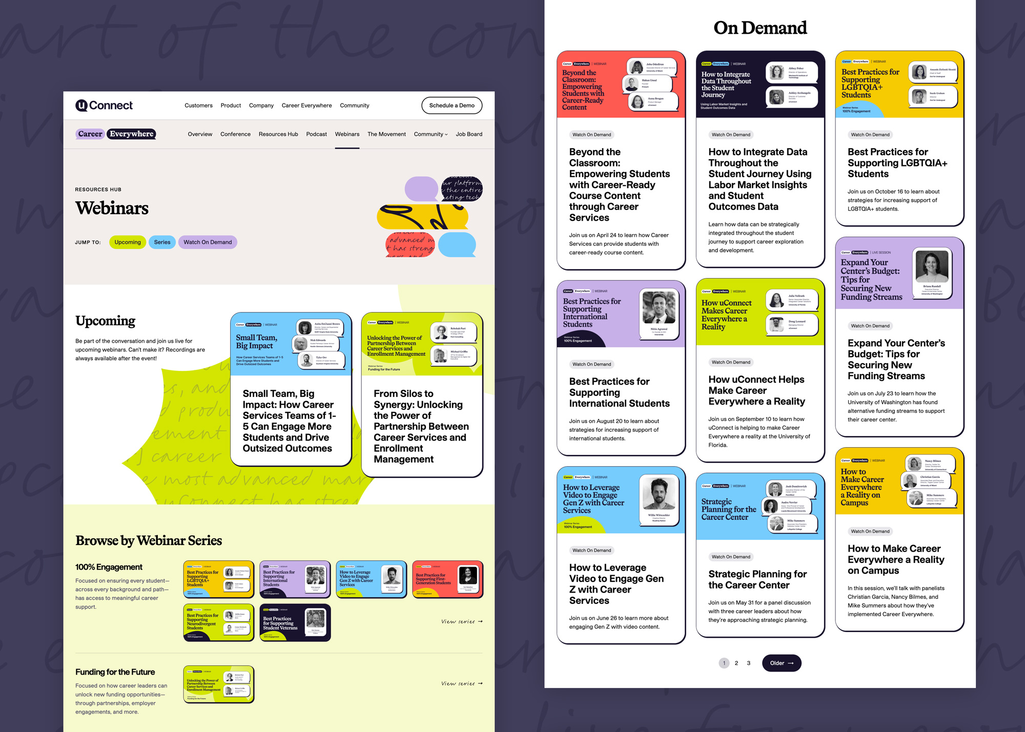
- The Job Board has dynamic filters created from the available positions' job levels and states. The jobs were previously all sourced by Marketing, which became very labor-intensive. I worked with their team to use Gravity Forms so that visitors could also submit job listings. When the form is submitted, a draft post is created for the team's review. There are subtle quality-of-life improvements, such as auto-calculating the job expiry date after 90 days so that users who skip sections still submit reasonable form data.
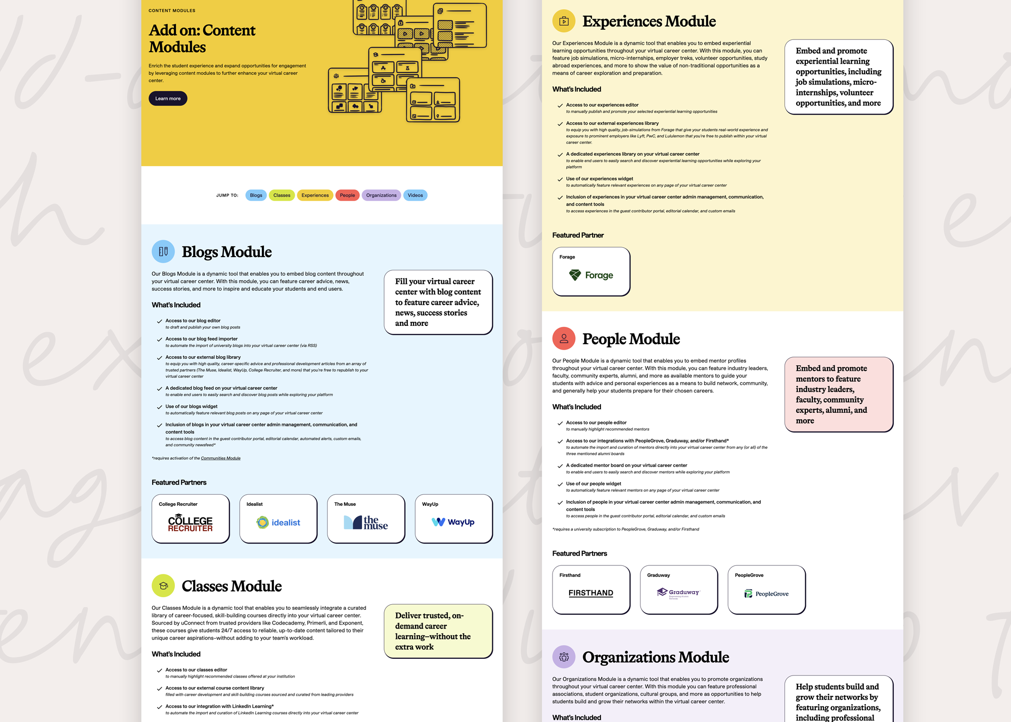
- On the Careers page, open positions are imported from Lever's API. This part was straightforward, but in my quest to make the site editable by non-engineers, I fed the data into a custom-developed Gutenberg block. The team can make any style changes, add or edit fields, etc. to control the content cards that are automatically populated.
- Similar to the Job Board, the Client Directory has a significant amount of data. I created a custom post type for schools, which is used in both the Client Directory list and as a source when pairing a school to a case study. This cuts down on data duplication so that we have "one source of truth" across the site. Metadata includes school size, academic populations served, logos, icons, and links to their uConnect virtual career center sites.
Accessibility Remediation
This project wasn't glamorous in the same way that designing new content can be, but it's absolutely crucial in uConnect's mission to make career services to everyone, anywhere, any time.
When I first started working with uConnect, the site had WCAG 2.0 AA compliance, but was overdue for a WCAG 2.1 update and needed significant maintenance to address the site updates since that 2.0 report. I led the remediation efforts for WCAG 2.1/2.2 AA compliance, which involved a comprehensive audit of the existing codebase and personally resolving the majority of issues. I also updated our VPAT report after both updates.
Impact
Stephy is a true Web accessibility expert. She audited & remediated myriad accessibility challenges in our product, then led the process that took us from WCAG 2.0 AA to WCAG 2.2 AA compliance in only a year. She rewrote our VPAT and developed an internal SLA system for triaging reported accessibility issues.
We had customers with entire accessibility departments evaluate her work and come away impressed at its breadth and depth.
When we were looking into a third-party accessibility audit by a top firm in the field, it took me 20 minutes with their sales engineer to realize Stephy knew far more than they did, and had already done more for us than a third-party audit would. That day alone, she saved us $20,000.
Accessibility & Inclusion
It's impossible to definitively say "this is accessible for everyone!" Accessibility is an ongoing effort to meet the needs of all users, which can vary widely based on individual circumstances — and goes far beyond just those using assistive technologies.
Many people who wouldn't consider themselves "disabled" can still benefit from inclusive design. By making our service accessible, we are remove barriers for all sorts of circumstances: physical, cognitive, preference, and more. For instance, captions on videos help not only those who are deaf or hard of hearing, but also people in noisy environments, non-native speakers, and those who prefer reading along. High-contrast text helps people with low vision, but also improves readability for everyone in bright sunlight or on small screens.
True accessibility means recognizing the wide range of abilities, devices, and assistive technologies people use. It's not a one-time achievement, but an ongoing commitment. By listening, learning, and making continuous improvements, we can keep moving closer to a more inclusive experience for everyone.
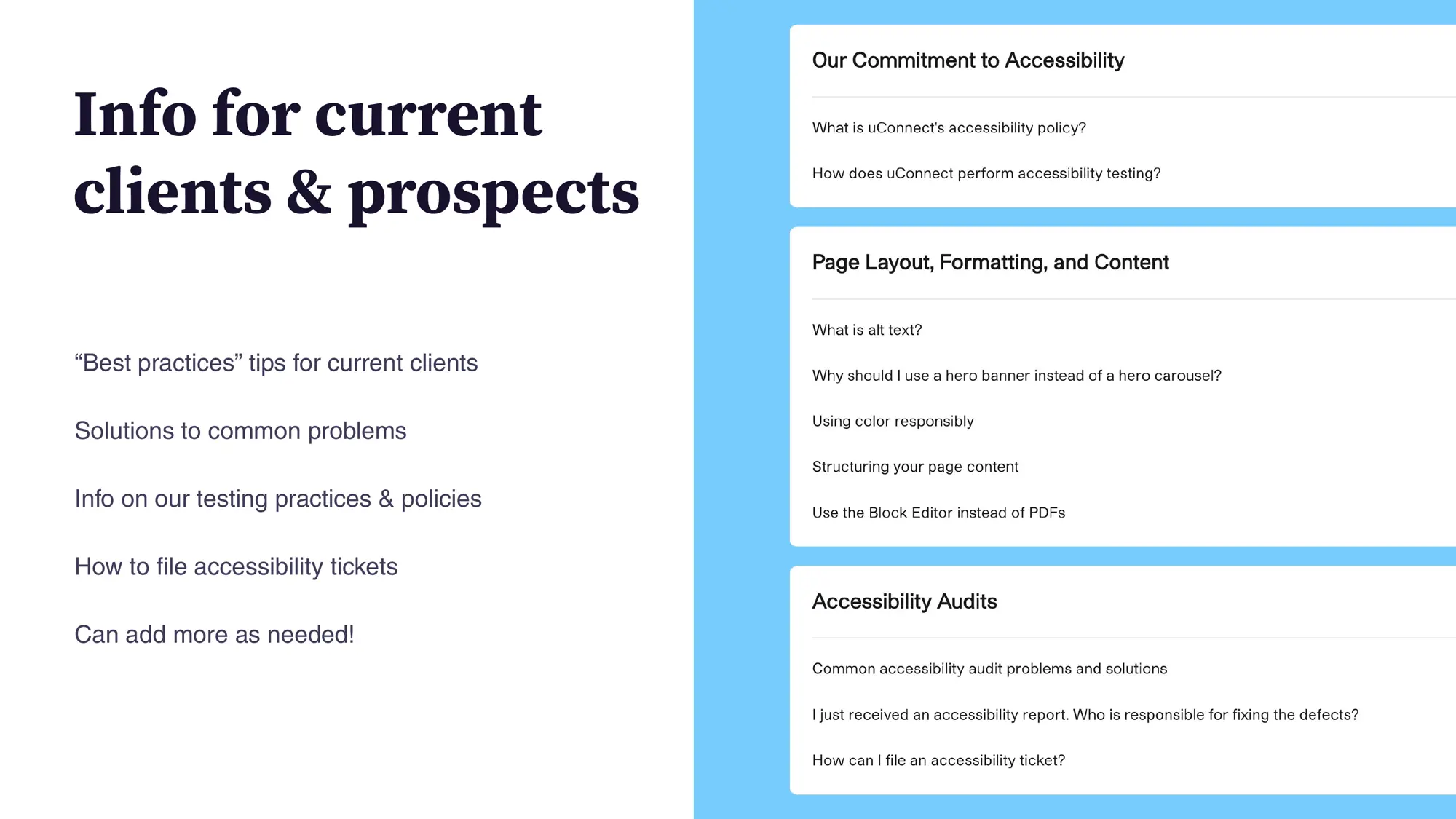
Client & Team Education
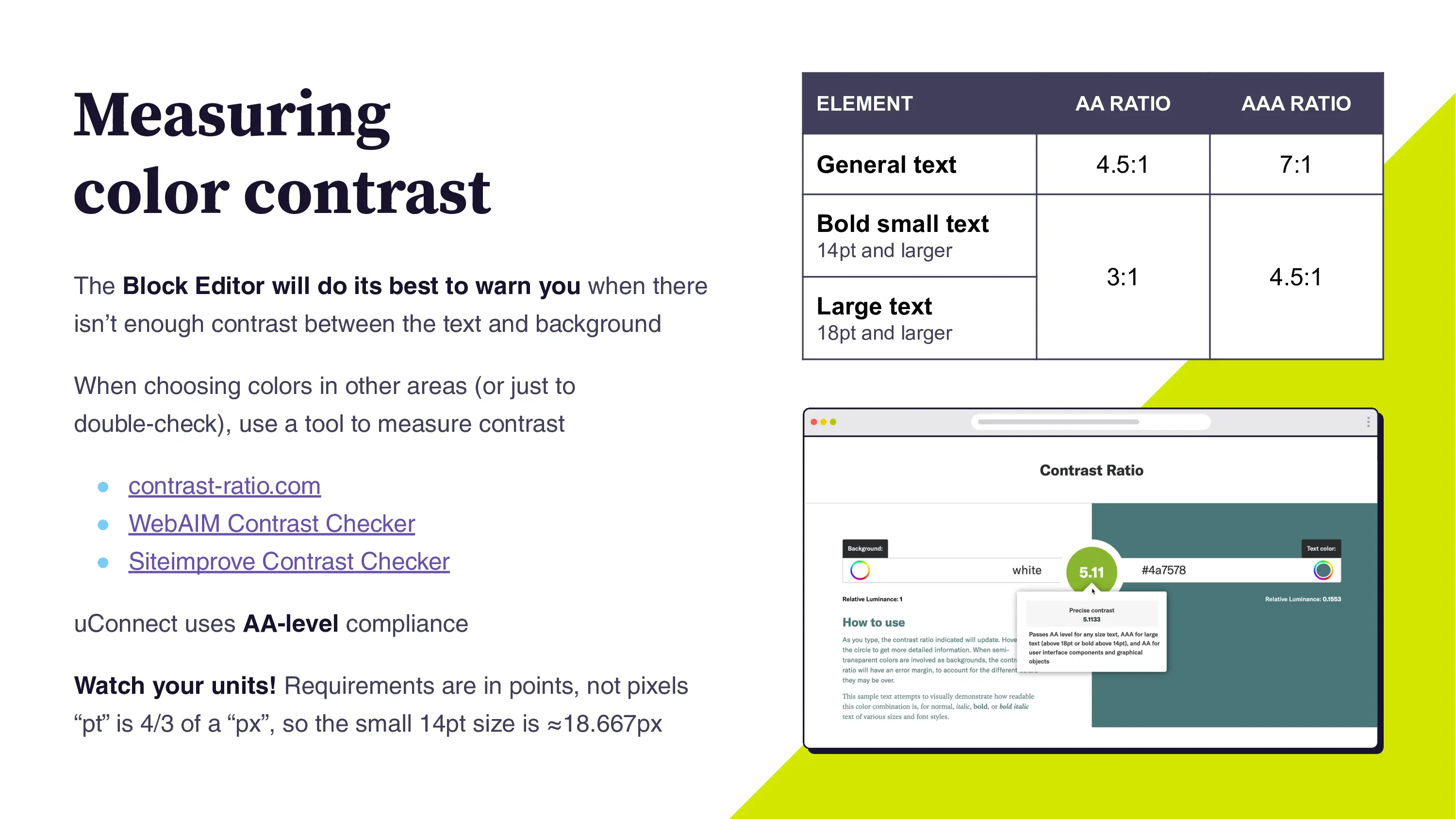
One challenge was "making robots happy"; uConnect clients may have strong accessibility initiatives at their schools and require ongoing accessibility testing from popular vendors. The trouble with automated scanning is that there can be false flags and some suggested fixes can even make the experience worse for users of assistive technology. It's important to manually review and understand the context of each issue, and a giant spreadsheet of defects can be overwhelming, especially to non-technical stakeholders.
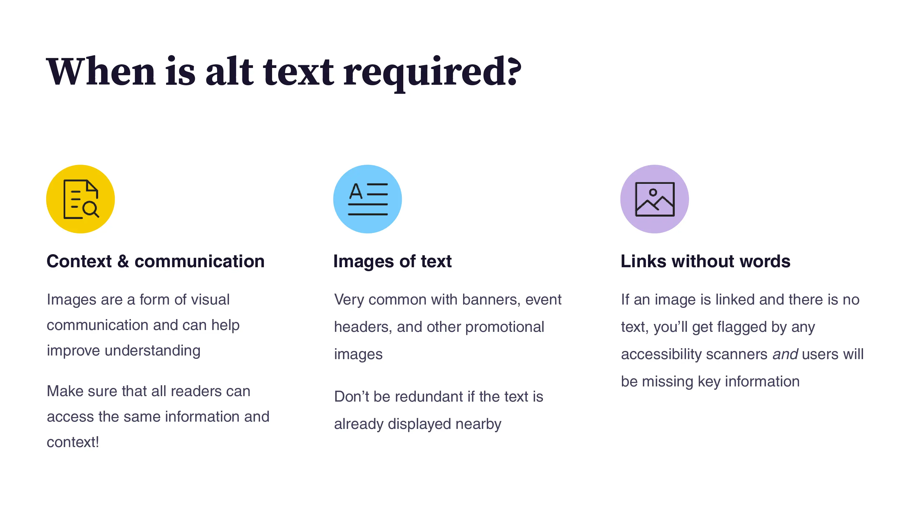
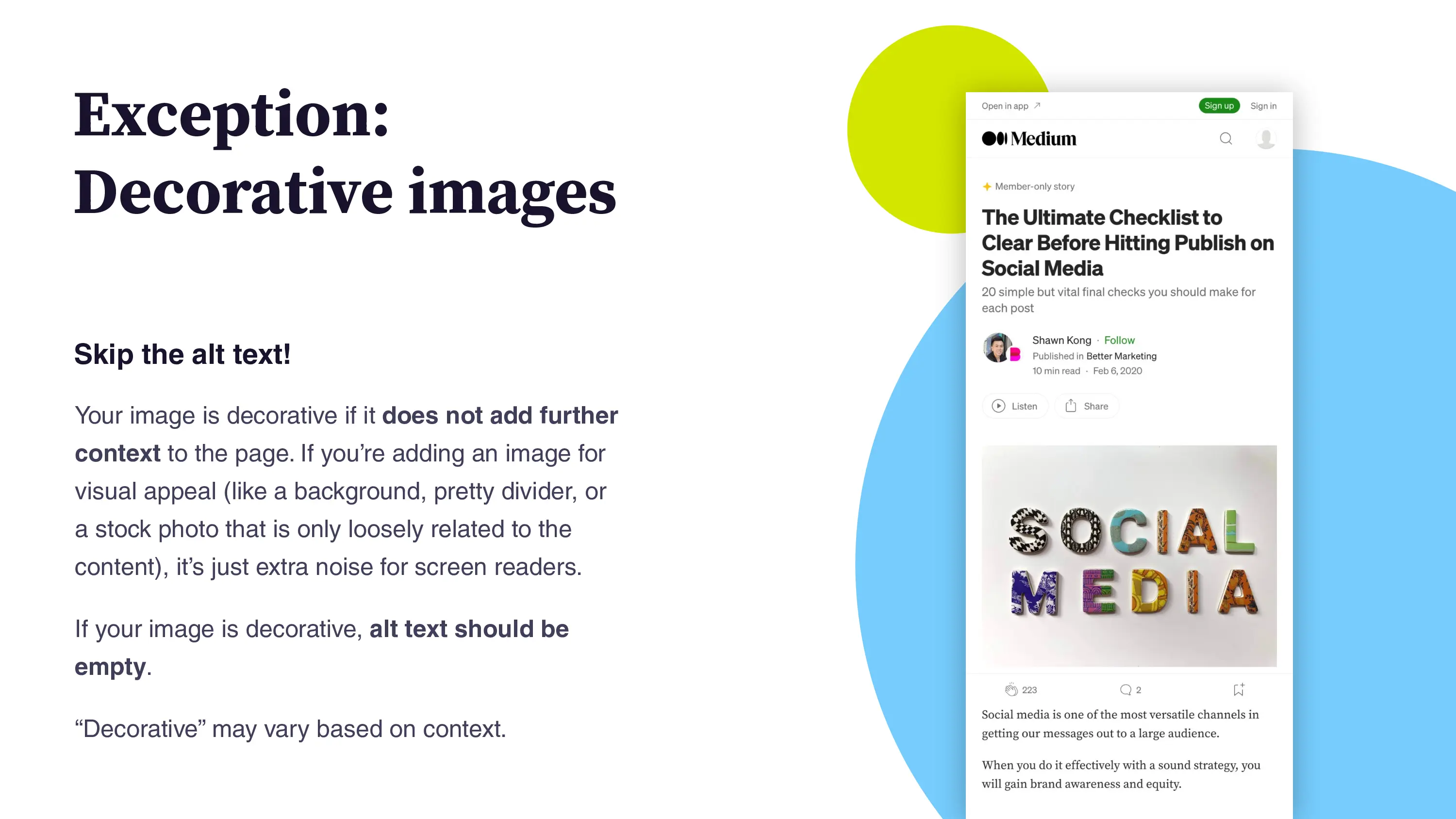
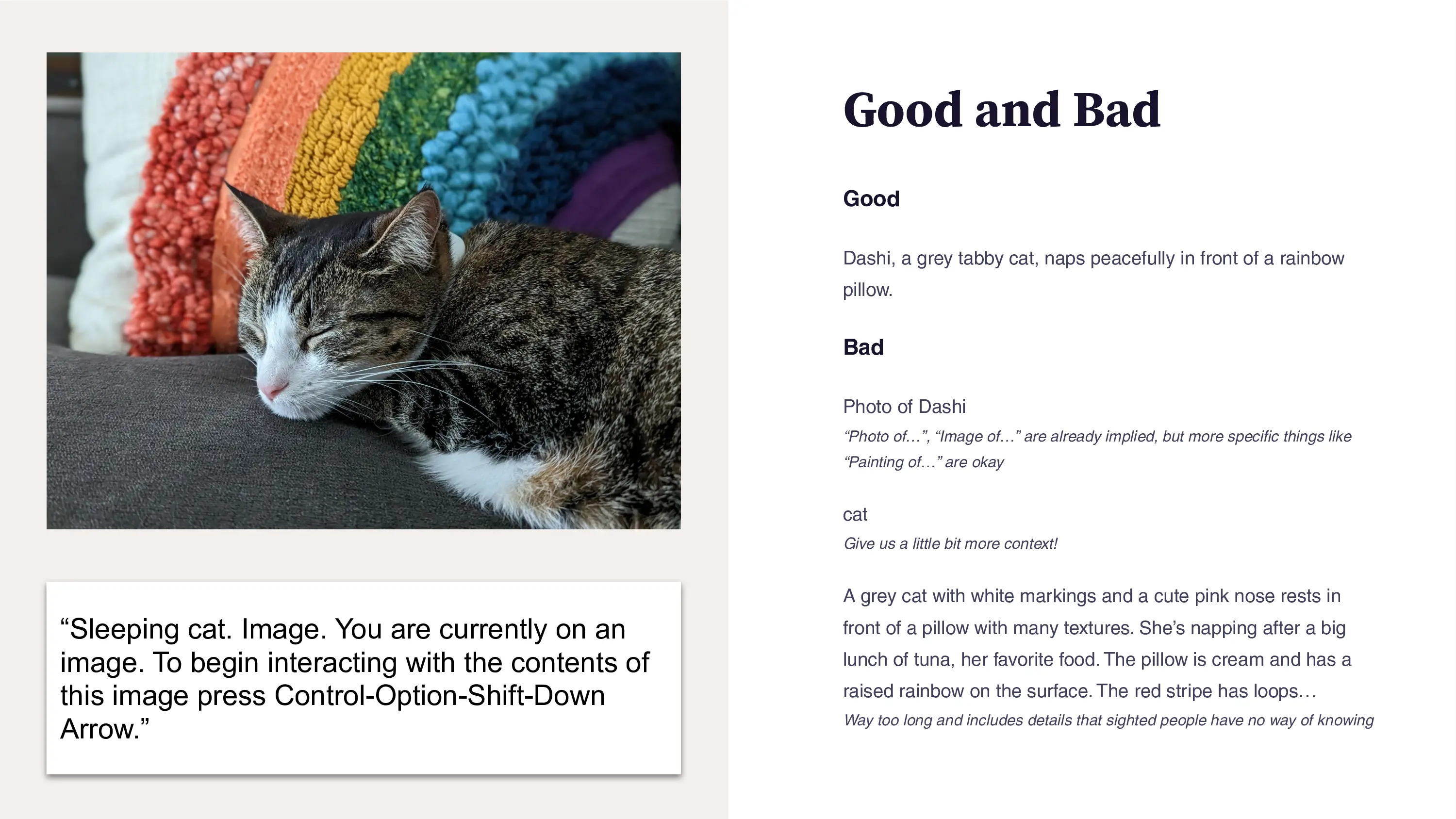
One common "defect" was the lack of alt text on certain images. This text is announced to screen readers, but can also be visible if an image fails to load. I updated our templates to correctly use alt="" or aria-hidden="true", but some automated scanners flagged these as an issue. When images are truly decorative (and things like blog post headers often are!), this is appropriate. A generic stock photo adds visual interest to the page, but e.g. "hands on a laptop" does not add helpful content. It's also important to pass in empty alt text or else the filename can be announced to screen readers. I wrote a knowledge base article for clients and the uConnect team to reference. In my internal accessibility presentation, I added links to some favorite resources:
- The New York Times, "The Hidden Image Descriptions Making the Internet Accessible" (backup link)
- Alt text as poetry
- Cooper Hewitt’s Guidelines for Image Description (great thoughts on inclusion and identity)
Improving Accessibility Reports
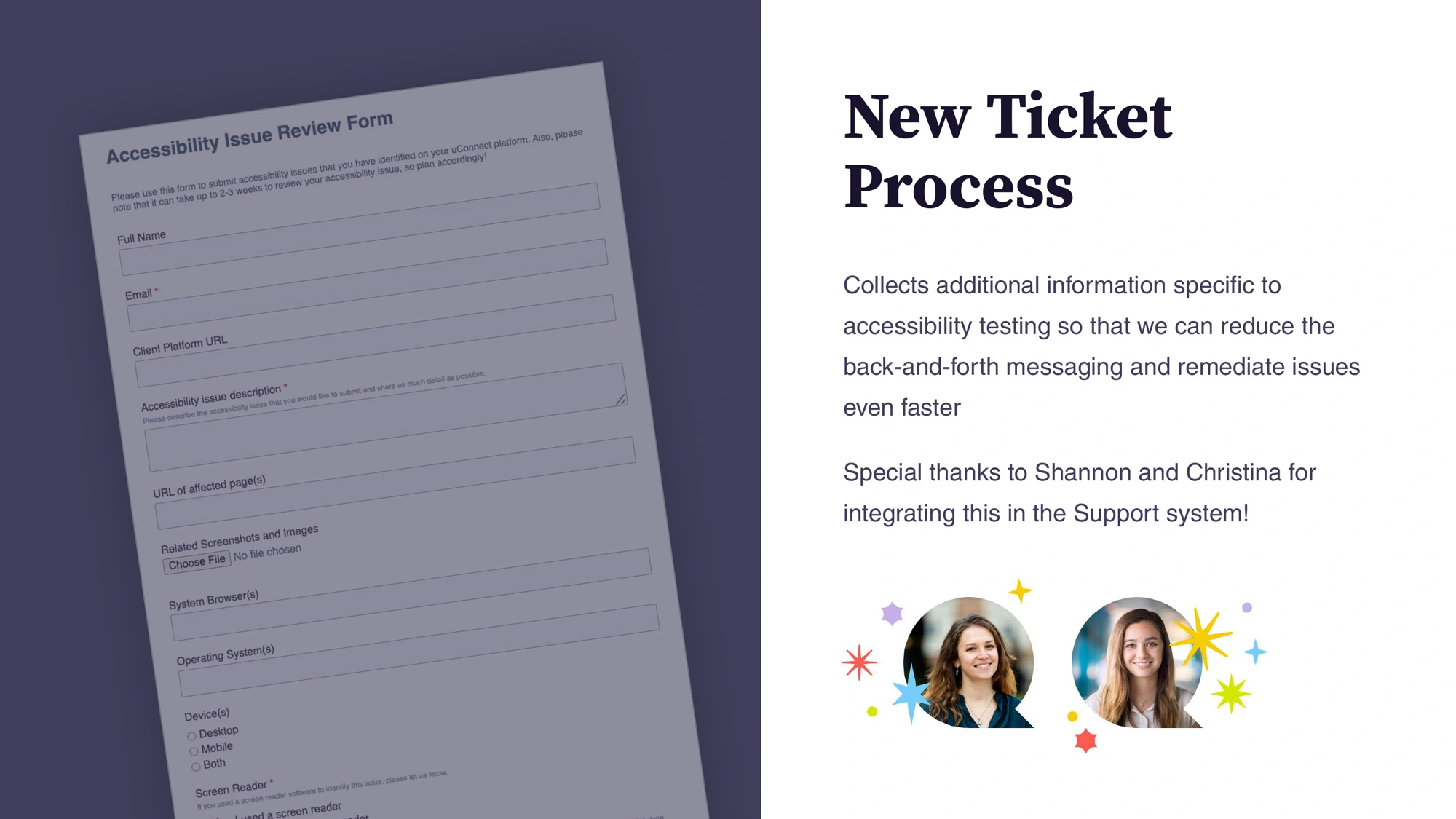
Earlier, I mentioned the gigantic spreadsheets or lists of accessibility defects that can be shared by an accessibility consultant or automated scanner. These are overwhelming for the client to receive, let alone uConnect's support team (and eventually, myself) who need to triage and fix the issues.
To address this, I partnered with the Support team to create a dedicated ticket type for accessibility issues. This allowed us to collect key details (e.g. screen reader software, browser version, operating system version) so issues could be reproduced and fixed more efficiently. The process was also updated to accept one ticket per issue type, making it easier to track progress and mark items as resolved.
This approach also encouraged clients to take ownership of their accessibility audits, prompting them to assess and prioritize issues rather than simply forwarding a long list for “someone else” to fix. As we expanded our knowledge base, we aimed to empower clients to address some issues independently.
Accessibility goes beyond code; content authors must also consider inclusive language, alt text, and best practices. By structuring the process this way, we reinforced that accessibility is a shared responsibility.
I wrote documentation to clarify which areas clients control (like blog content) versus those managed by uConnect (such as core platform features). This helped set expectations and made ongoing accessibility maintenance more transparent.
Streamlining Remediation with Reusable Patterns
As I continued to work on the accessibility initiative, I focused on streamlining the remediation process. Some tasks, like adding keyboard navigation, would become excessive if the code was repeated multiple times. I created many small helper scripts that I could reuse, such as a “roving tabindex” pattern. If you have ever tried to navigate through a long page with your Tab key, you know the frustration of getting stuck on elements that aren't designed for keyboard navigation; you may have to press Tab many times before you can reach your destination. A roving tabindex pattern allows a “wrapper” to gain focus, with arrow keys navigating between focusable elements within the wrapper.
To go along with this approach, I also created :focus-visible styles. These only show up when navigating with a keyboard; not when elements are clicked.
Take a look at some of the remediation walkthroughs:
This content is protected
Enter the password to unlock all secret content
More Case Studies
View all case studies
Chicago Fair Trade
Chicago Fair Trade is the largest fair trade organization in the United States, increasing support for economic & environmental justice through consumer education, advocacy, and promotion of local fair trade businesses.
I worked with CFT for ~16 years on their websites, event graphics, standalone websites, and more.
bridge21
bridge21 is a B2B and B2C fintech company using cryptocurrency to power more affordable international remittances.
I worked with bridge21 for 4½ years and was involved with everything from pitch decks to web development, branding, prototyping, and strategy.