Case Study Overview
- Who
- bridge21 is a B2B and B2C fintech company using cryptocurrency to power more affordable international remittances (no actual understanding of crypto required for end users).
- What
- I joined the bridge21 team as a contractor before the company was even called bridge21. As an early team member, I wore many hats and had a wide range of responsibilities. Hired as a graphic designer, but swiftly took responsibility for all things UI/UX, print and digital design, and frontend development. I worked on pitch decks, branding, prototyping, microsites, strategy — and even explaining crypto to investors at a fundraising conference.
- When
- July 2014 – July 2018; Spring 2022
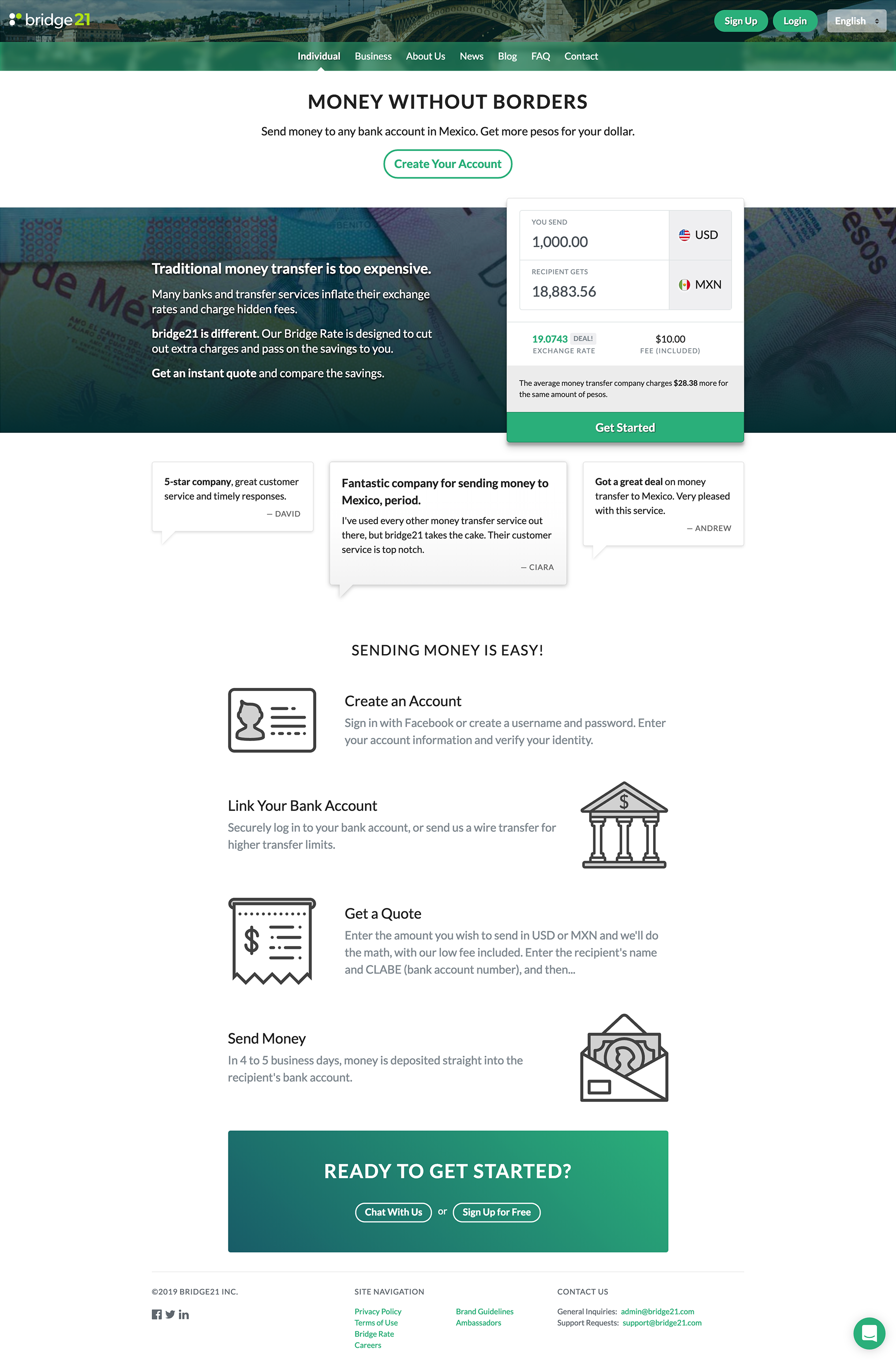
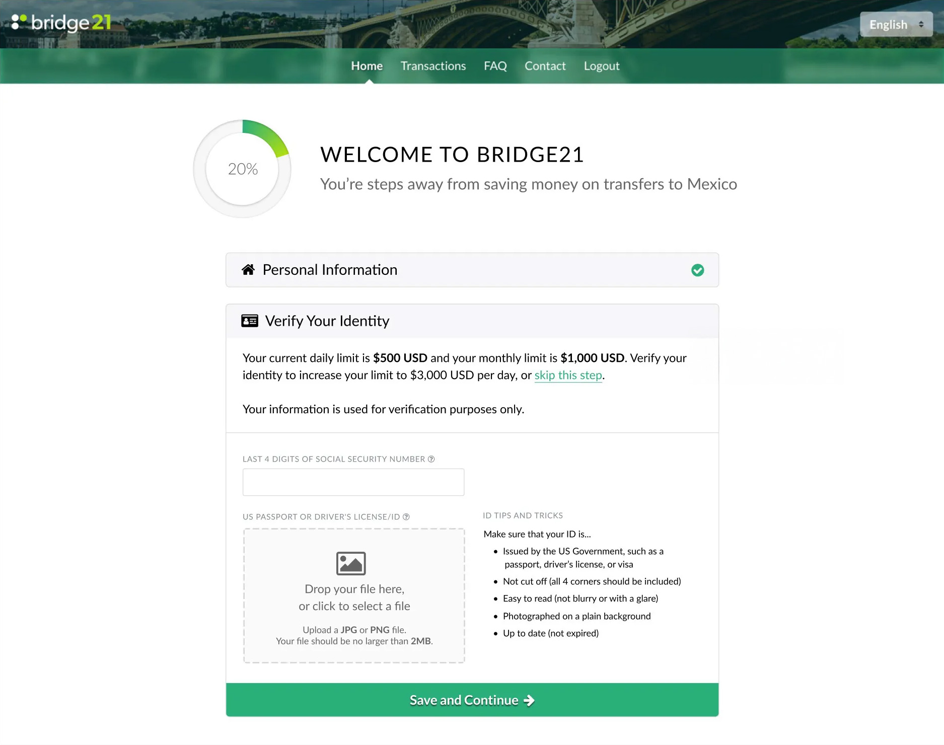
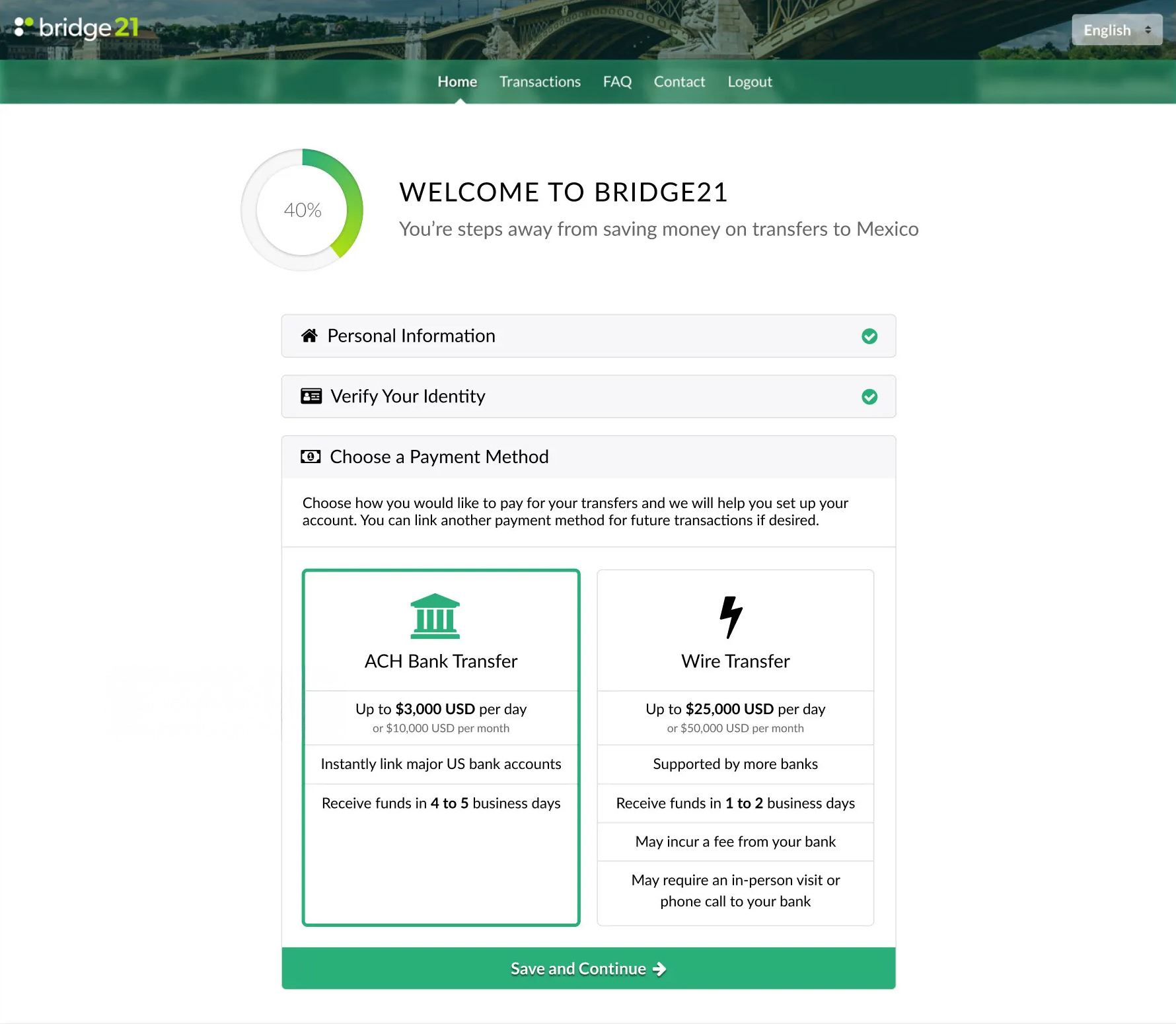
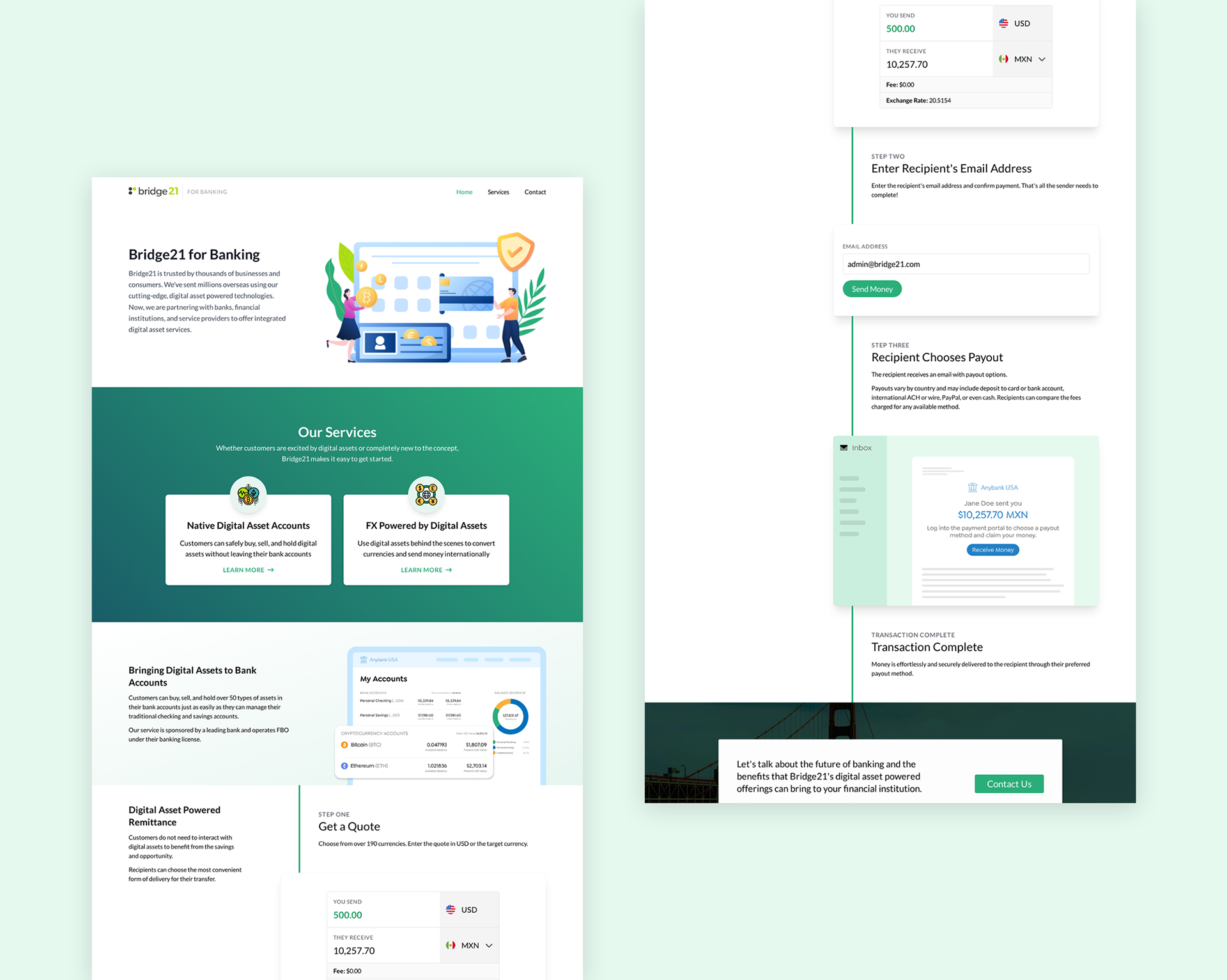
Main Website
The website went through a few iterations and tech stacks during my time with bridge21, so I had the unique challenge of implementing a very similar interface across different frameworks and languages.
The website integrated with our quoting engine as well as KYC providers and bank-linking providers. We handled authentication with Auth0 for local and social-based account registration. Later implementations of the site were also multilingual and had a language switcher — my first foray into i18n!
Though techniques like the blurred background in the header and the conical gradient in the progress circle are commonplace today, they were harder to pull off before some of the CSS3 features, and I was proud of my implementations.
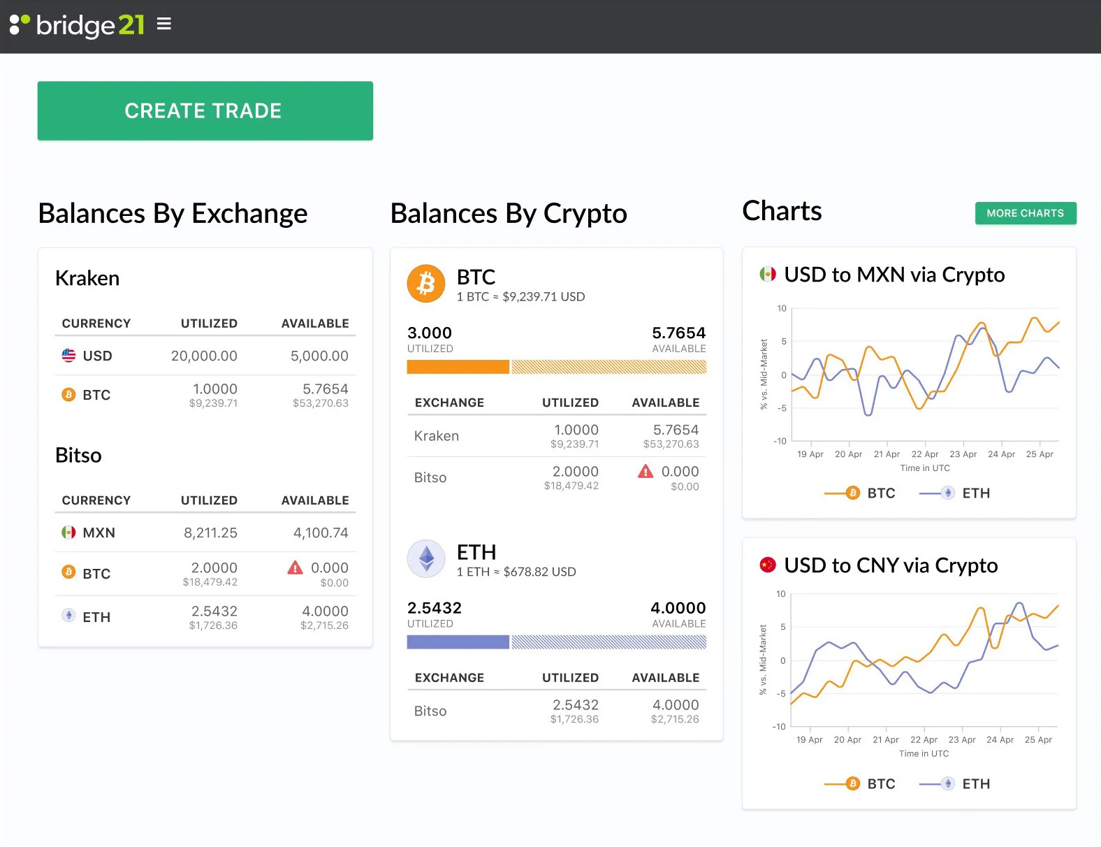
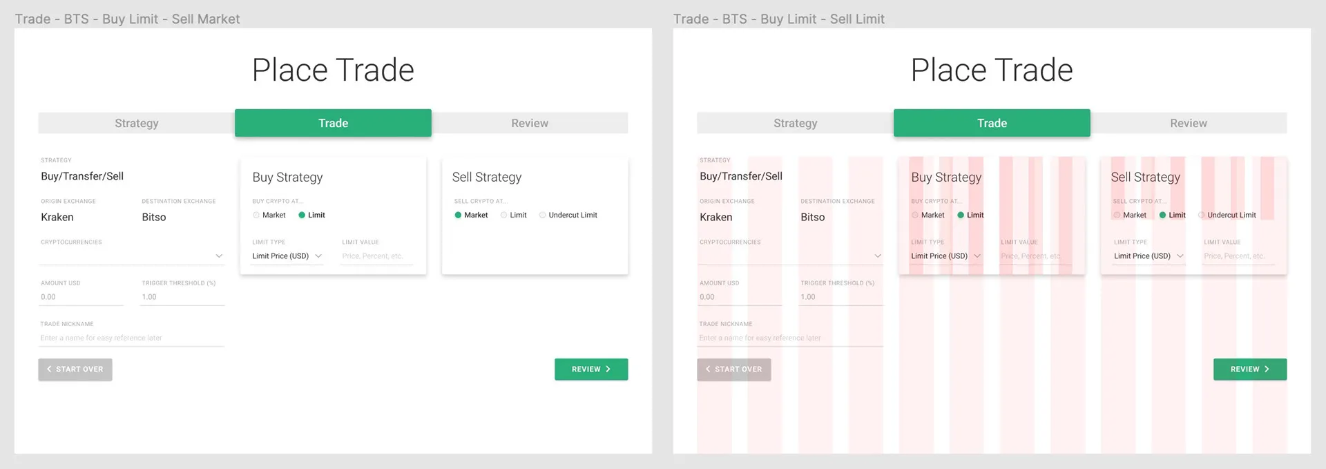
Back-of-House Dashboard
I created prototypes of the back-of-house trading interface using Figma, then helped implement them with the Material framework.
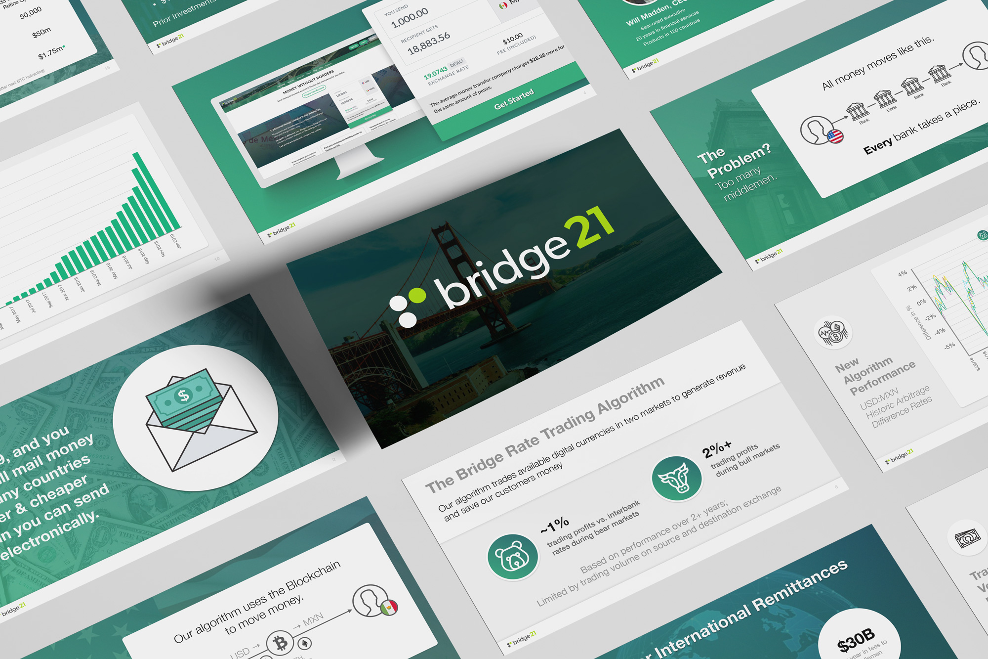
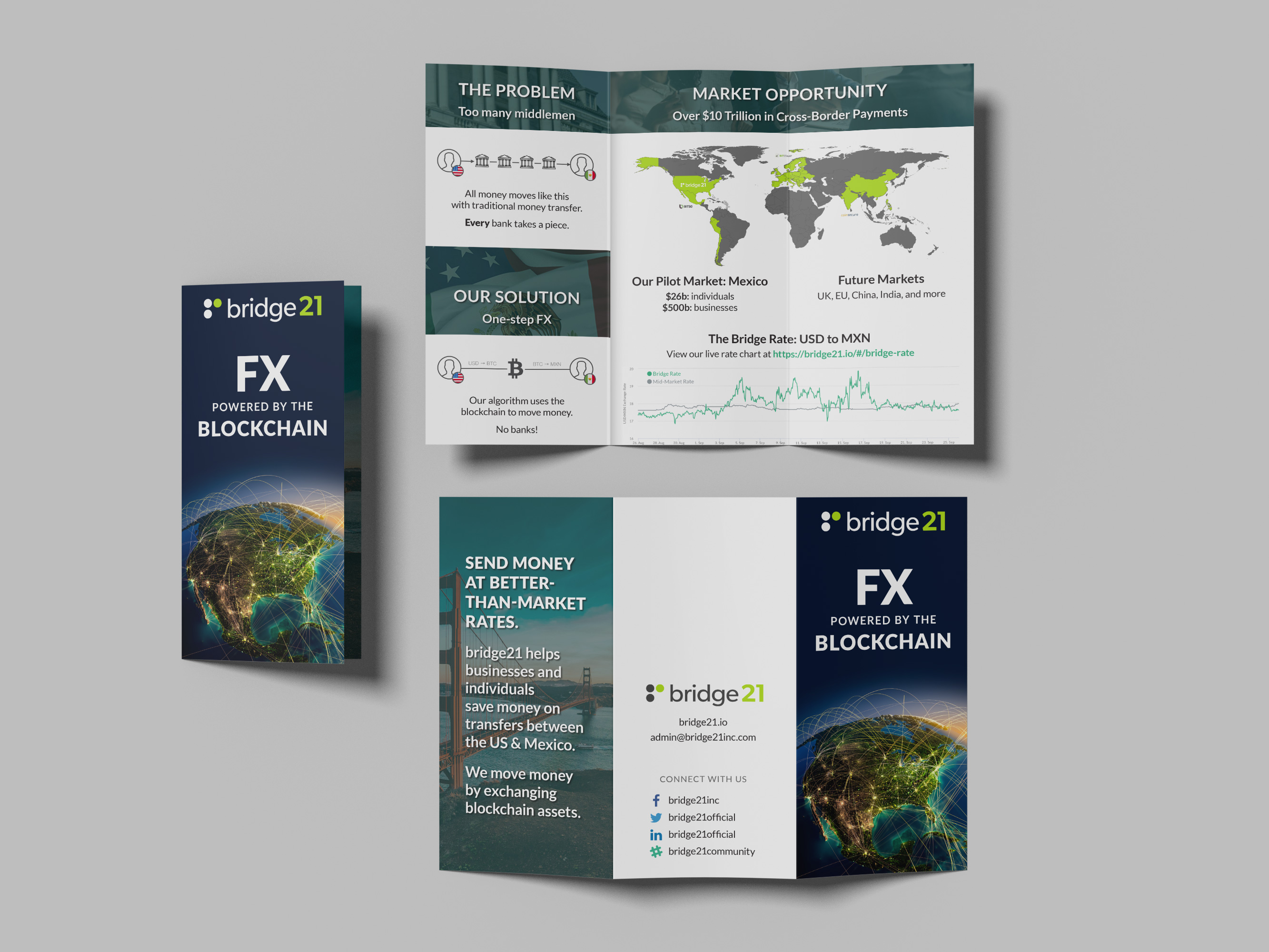
Pitch Deck & Print Design
Conference & Demo
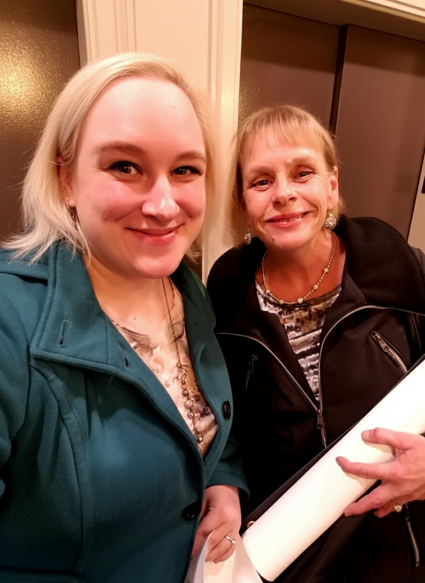
I represented bridge21 at the FUND Conference in Chicago… accompanied by my mom! We met with investors and talked about the bridge21 workflow. As someone typically behind the scenes and not involved in the sales process, this was an unusual role for me, but my team couldn't pass up the opportunity to have one of our locals attend the conference.
Explaining the product simply to a non-technical audience prepared me for investor conversations. I practiced the pitch with my mom; she picked it up fast and confidently handled conversations at the conference, which was a proud moment. As she works in a more traditional sector of the finance industry, we made a great duo to discuss the benefits of bridge21's innovative approach.
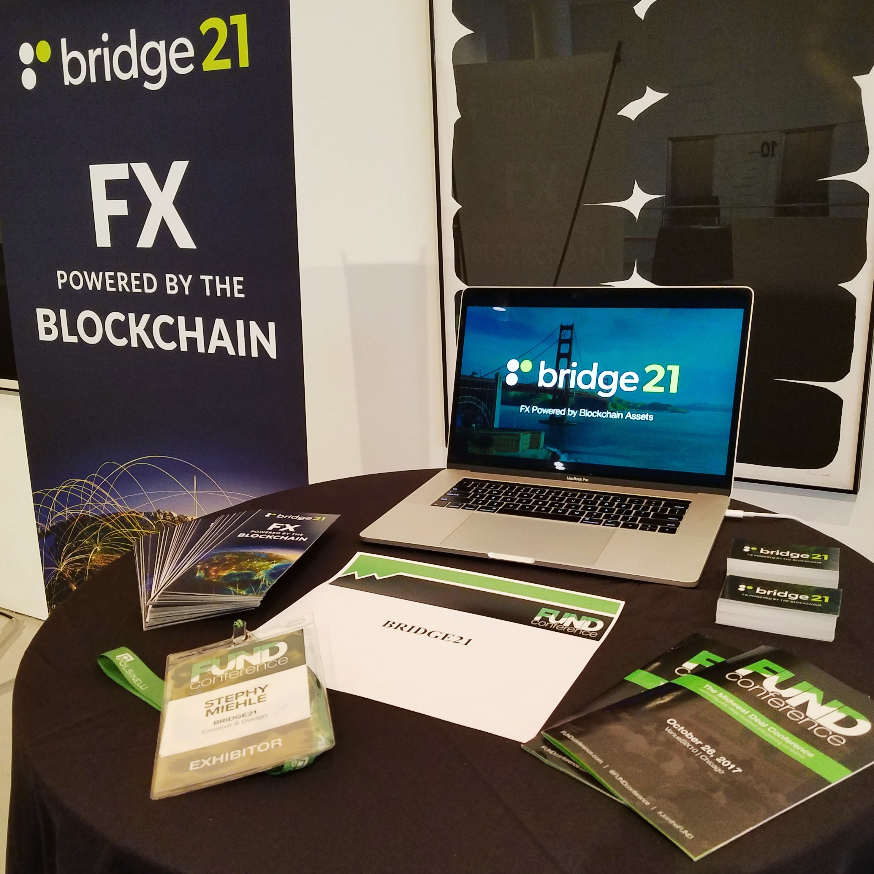
This is the demo video we played on the conference laptop — it's a little sped-up, but was recorded with real API interactions and not mocked-up at all. The video also features some voiceover work from yours truly.
Landing Pages
Unsurprisingly, startups pivot. The B2C space was difficult to break into, and the support required to assist individual users became very time-consuming. As bridge21 focused more on B2B clients, the team needed to create tailored landing pages for a new audience.
Many traditional financial institutions are more conservative and risk-averse, and talking about the marvels of technology didn't sell the right message. We needed to be fresh — but not too fresh. We focused on straightforward process-based storytelling to show how easy remittance can be.
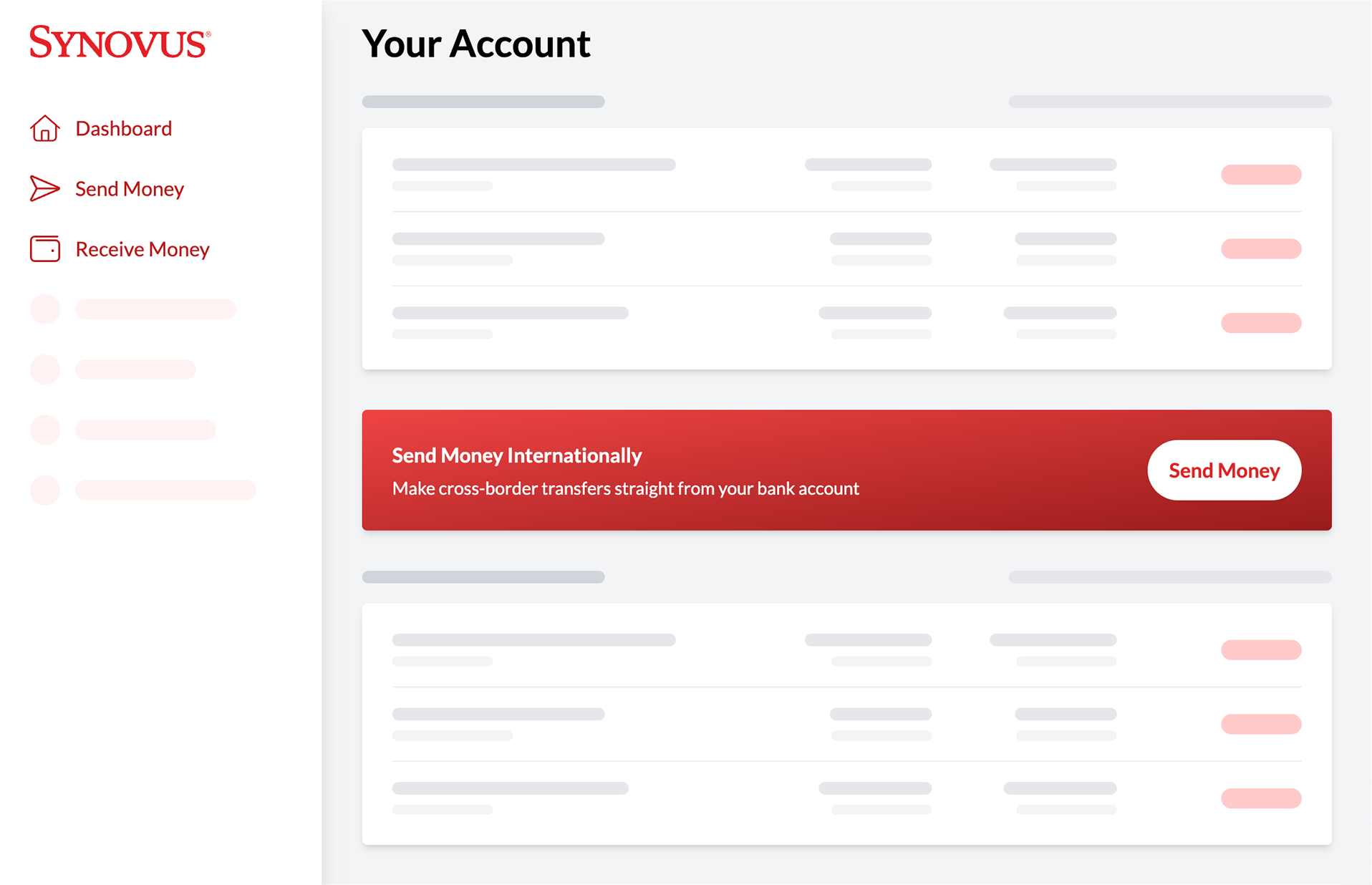
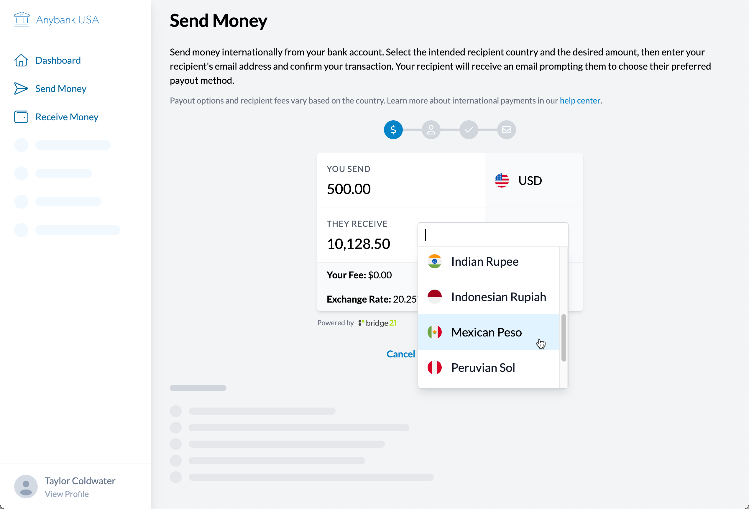
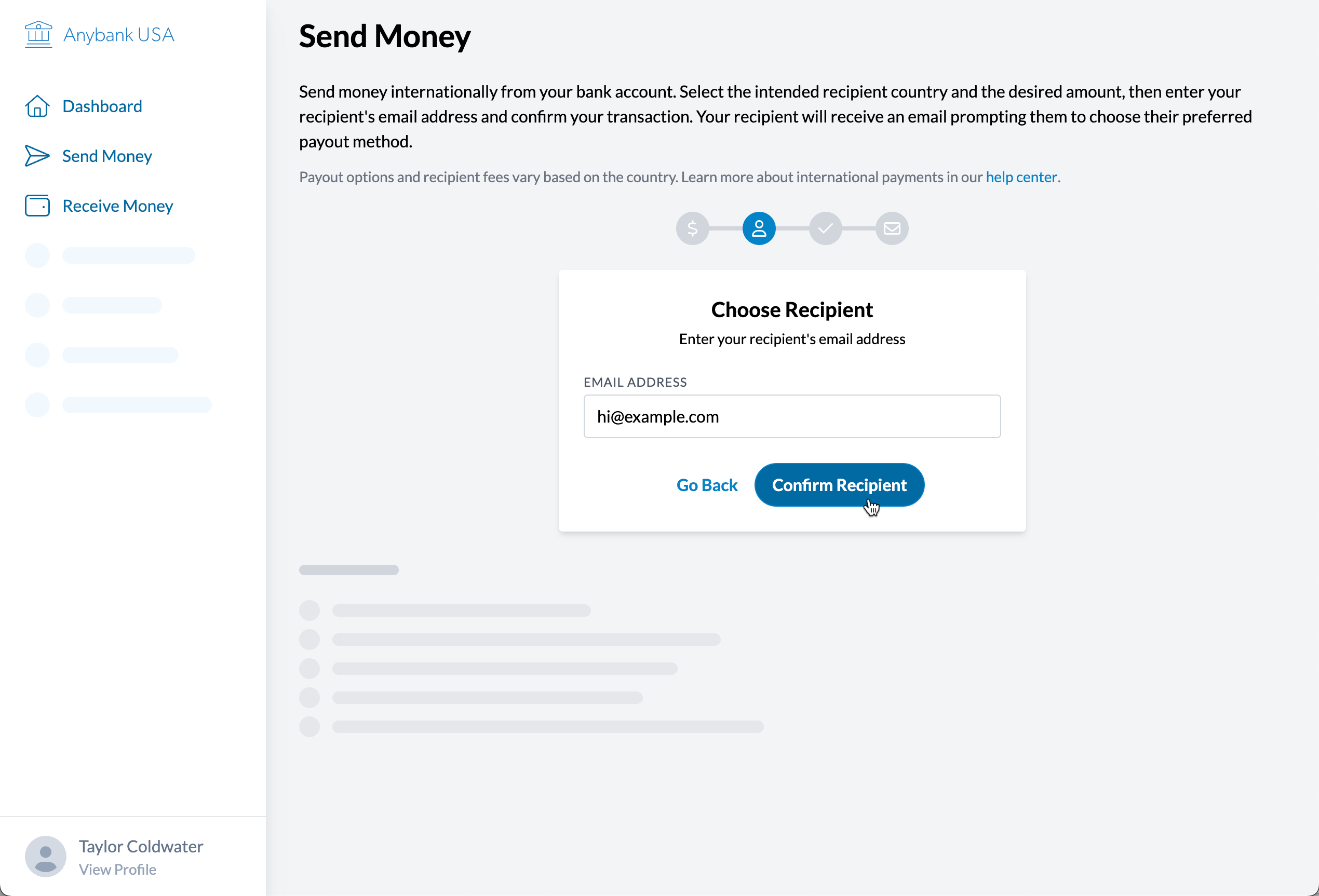
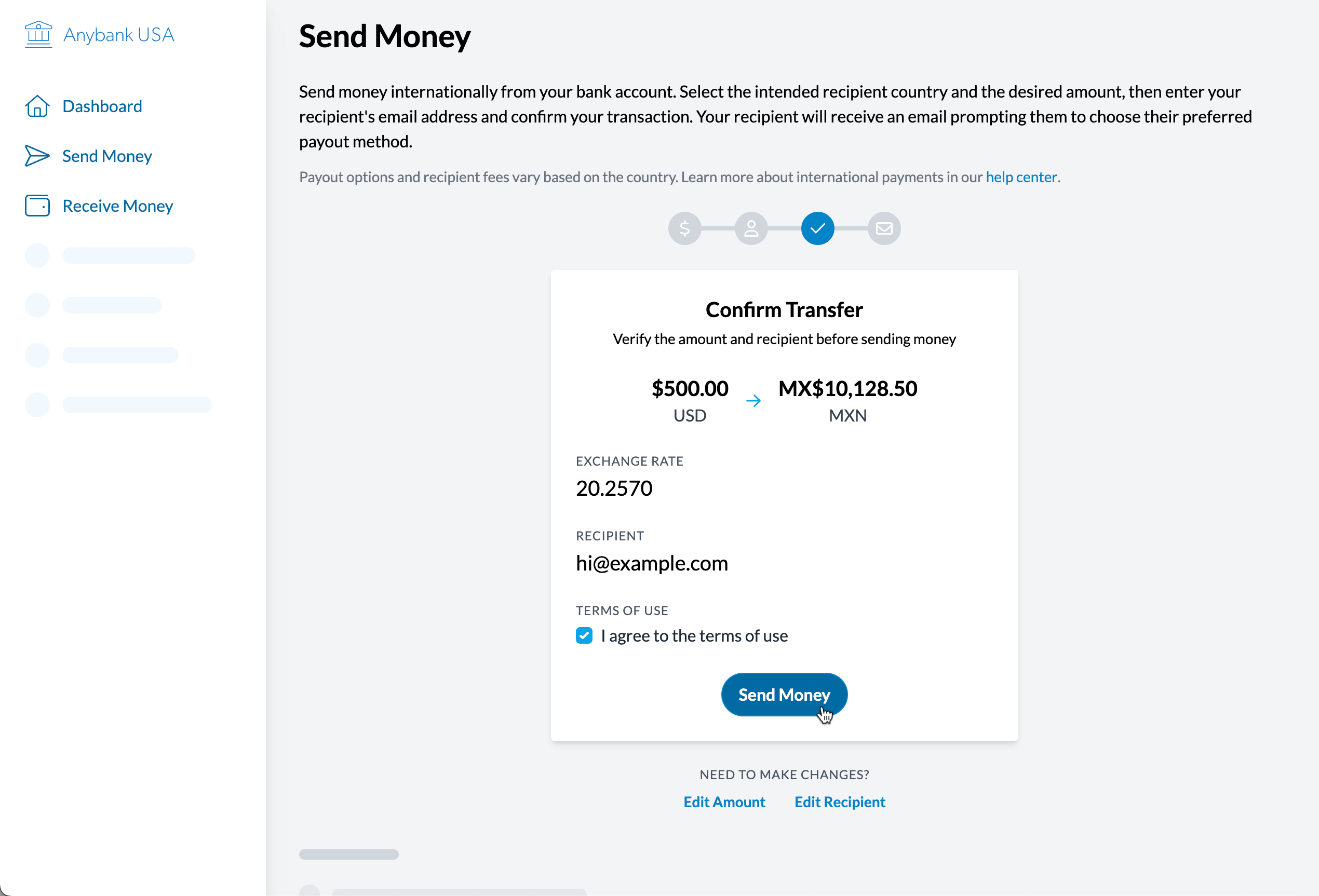
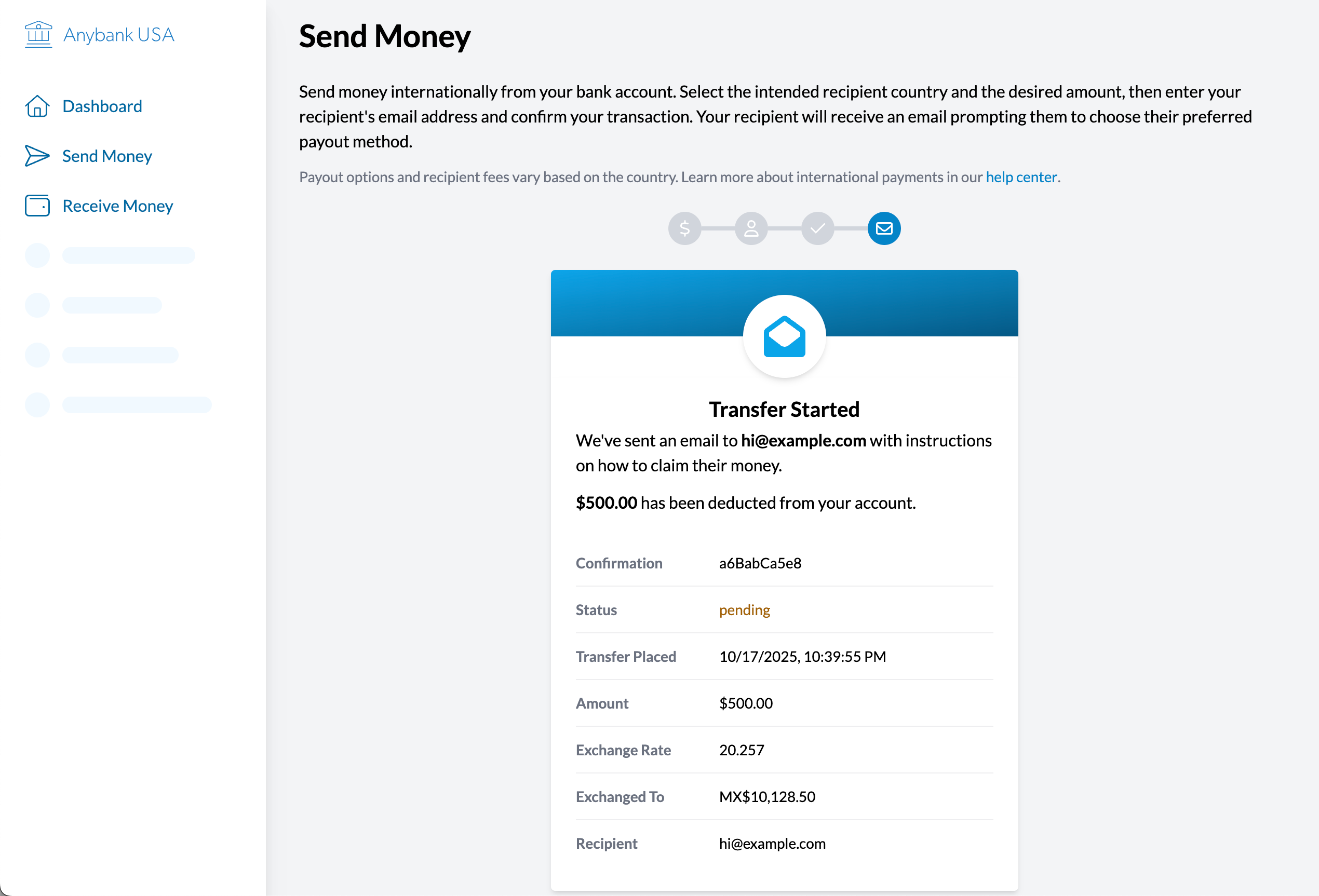
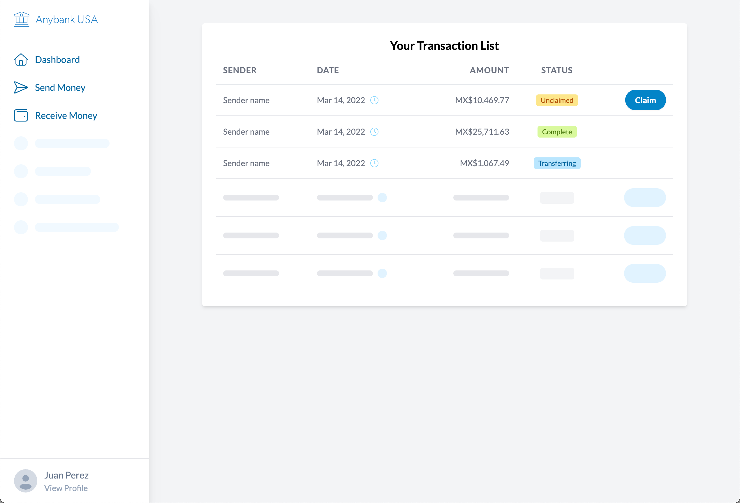
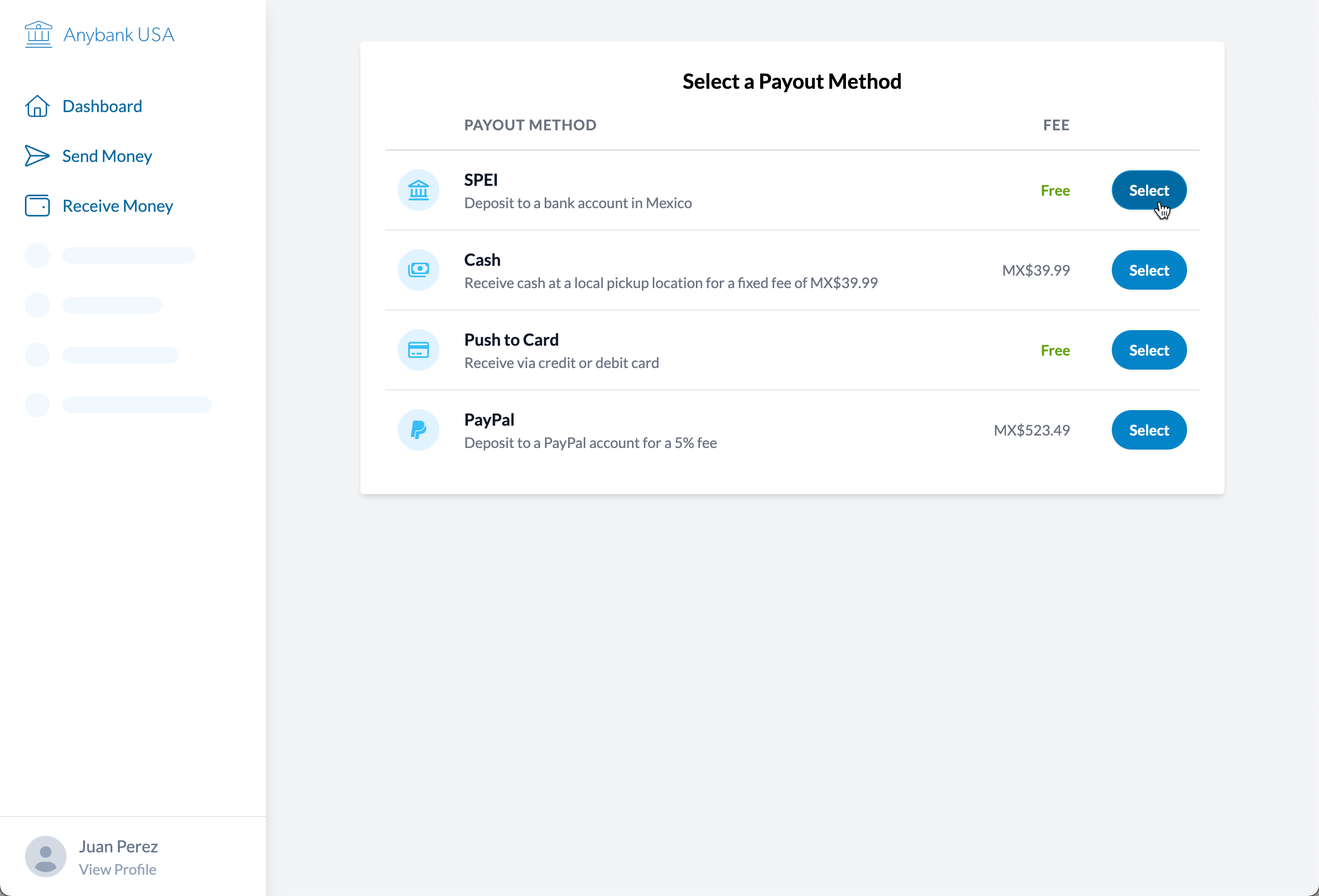
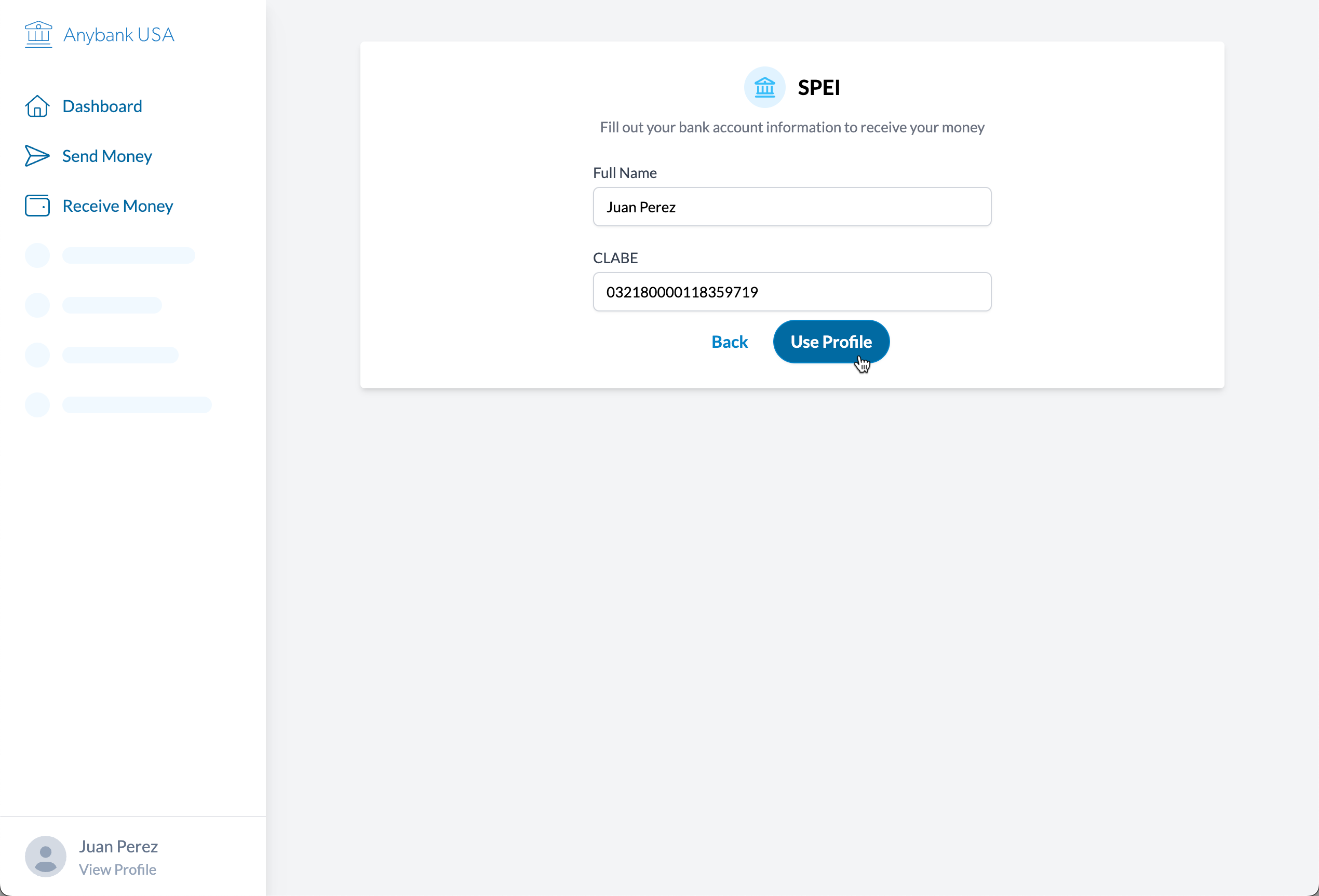
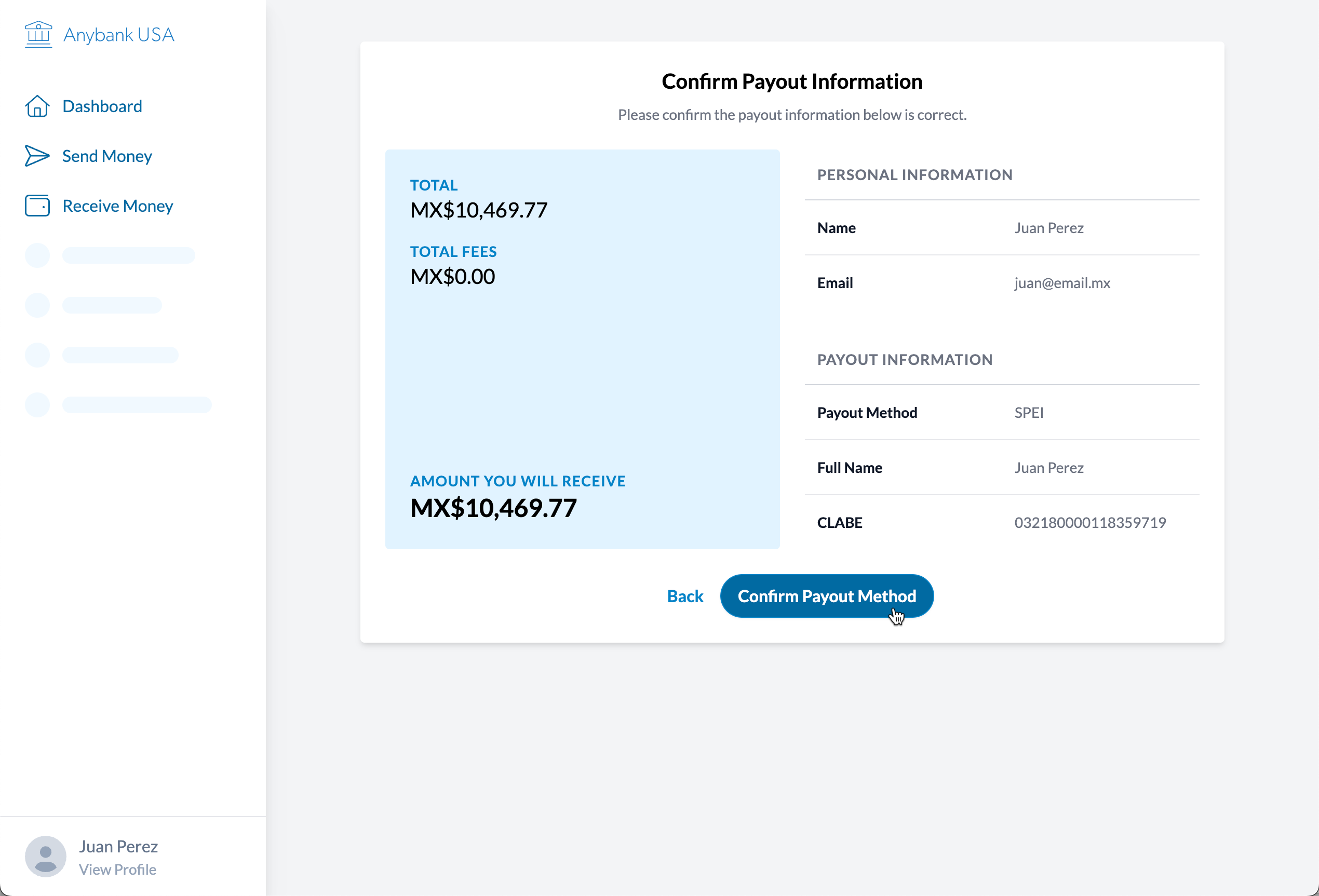
Themeable Prototype
Ahead of a meeting, the bridge21 team could add the logo and colors for the banking client in order to make the service seem more real — and also already a part of their brand.
The prototype was built with Tailwind, which has a built-in color palette. The team member running the meeting could quickly select a primary theme color from the list and all of the lighter and darker shades would be generated from the framework. There were two main userflows: sending and receiving money.
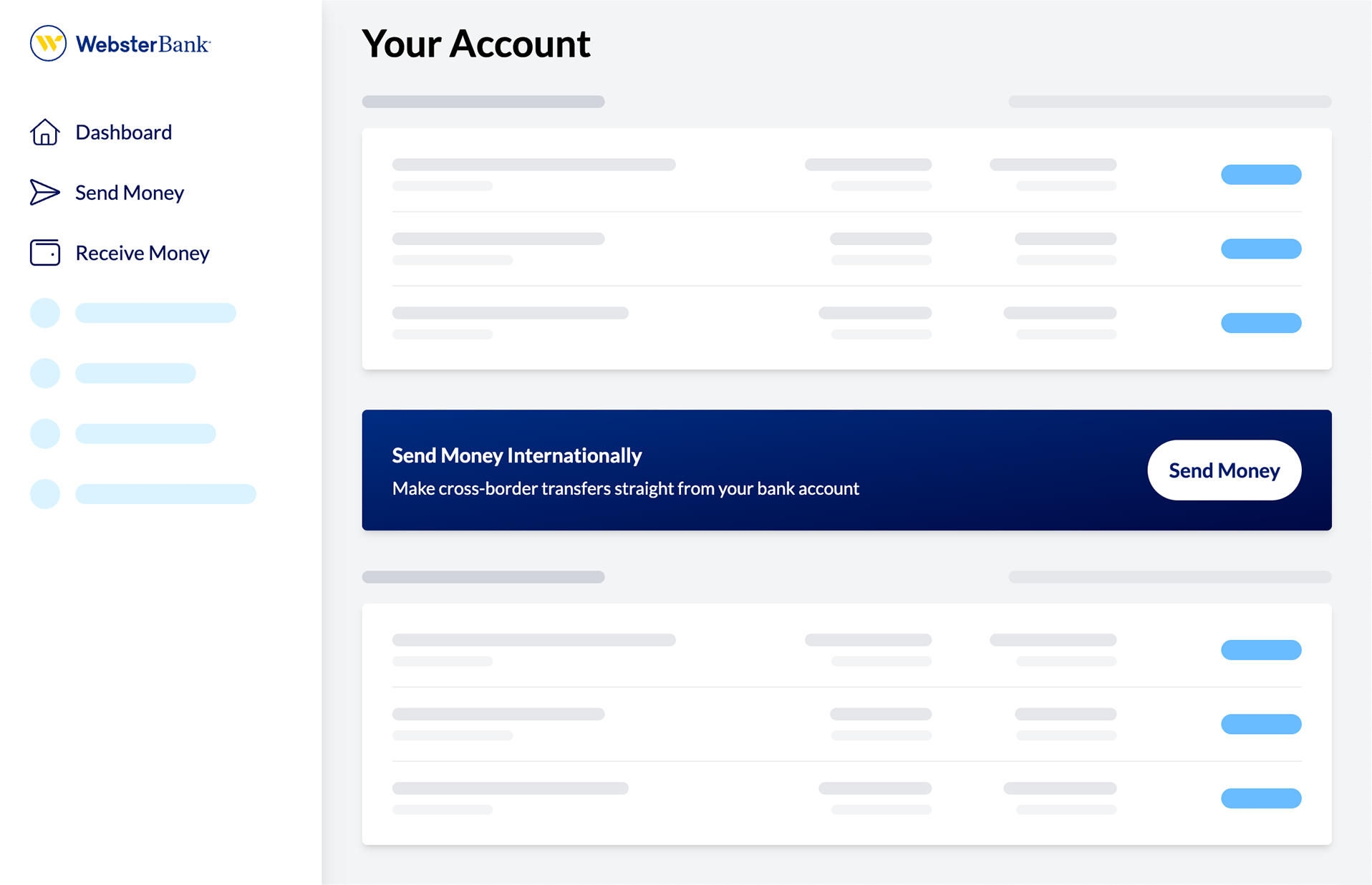
Sending Money
Receiving Money
More Case Studies
View all case studies
Chicago Fair Trade
Chicago Fair Trade is the largest fair trade organization in the United States, increasing support for economic & environmental justice through consumer education, advocacy, and promotion of local fair trade businesses.
I worked with CFT for ~16 years on their websites, event graphics, standalone websites, and more.
uConnect
uConnect is a virtual career services SaaS platform supporting hundreds of college & university career centers.
I work with uConnect as a UX & Accessibility Engineer, with a focus on the frontend. I've led major initiatives for accessibility compliance, email templates, and the development of the marketing website.